KROHN CONSERVATORY
Co-designer: Rose Bacon
Co-designer: Libby Birkley
Co-designer: Gracie Clark
The Challenge
Visually impaired visitors of Krohn Conservatory may not get a comprehensive experience due to an inaccessible signage and navigation flow. Since visually impaired individuals are statistically prone to nature deficiency, an inclusive, multi-sensory experience would allow them an equally fulfilling nature experience as fully sighted visitors.
The Solution
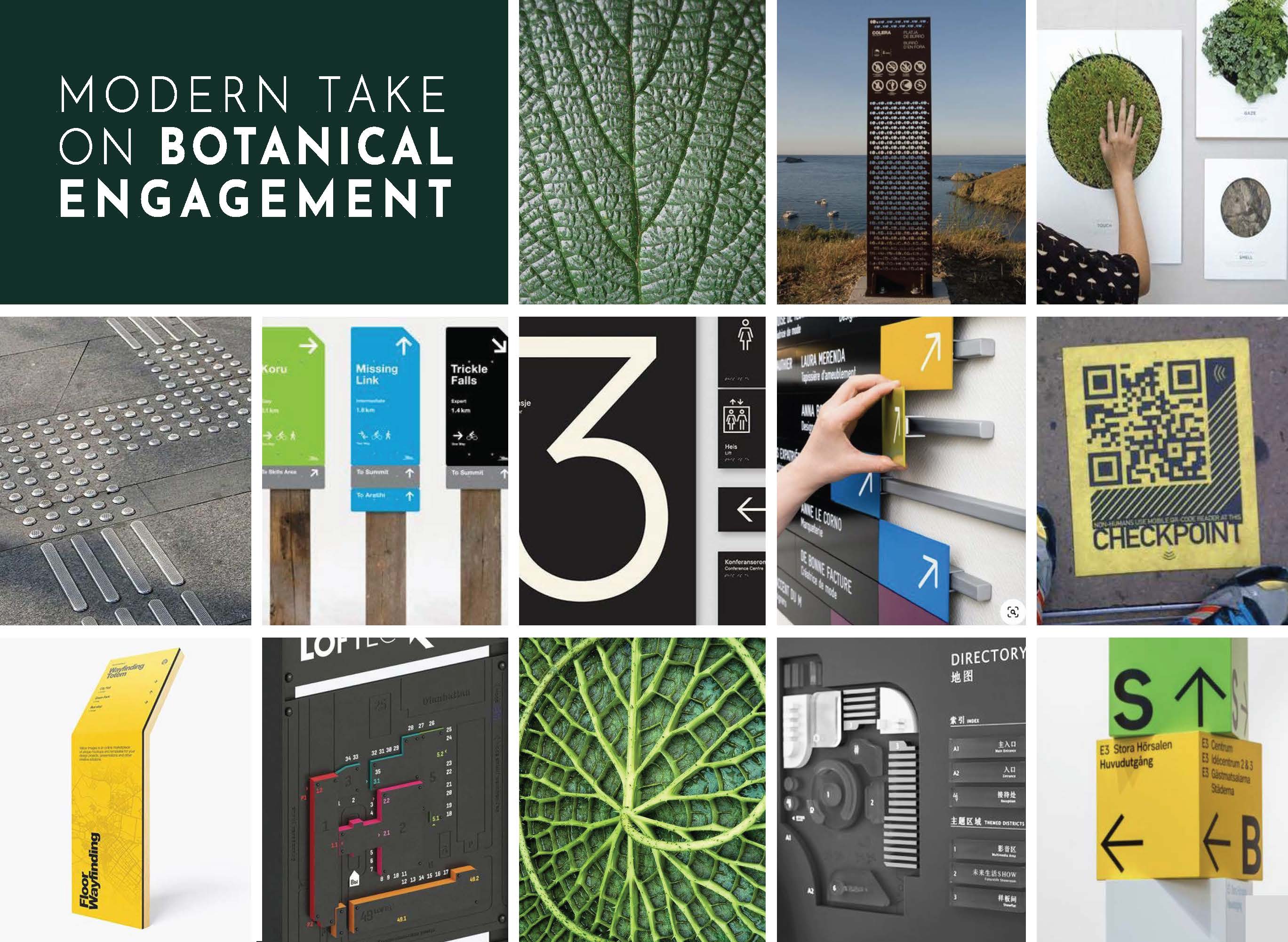
To address accessibility challenges, we developed a design system that prioritizes tactile exploration, adaptability to the environment, and clear legibility of information. This approach ensures an inclusive and engaging experience for all users, especially individuals with visual impairments.

STAGE 1
ResearchBenchmarking
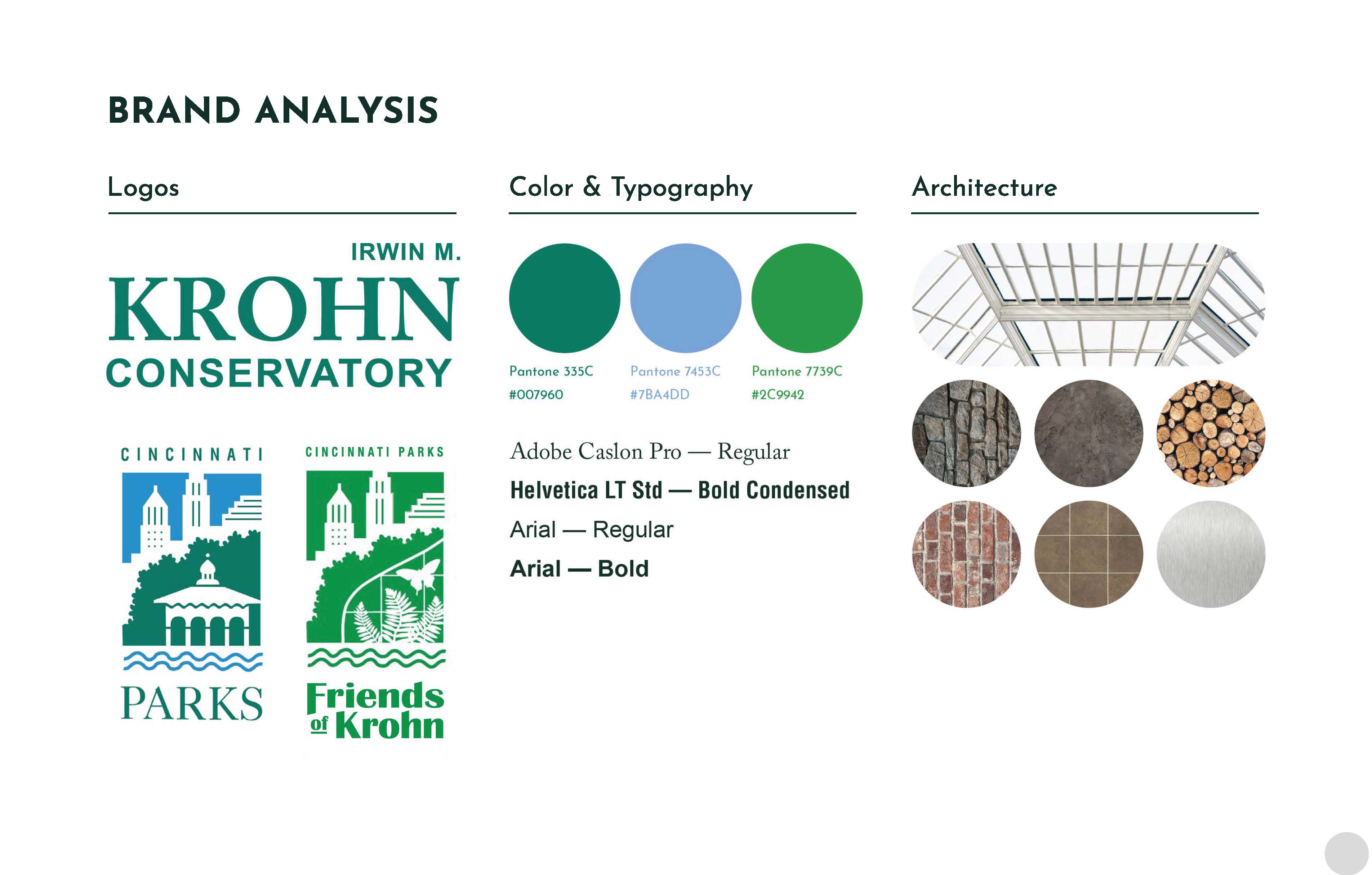
Examining the existing design system, brand identity, and spatial experience to understand how they currently support or limit user engagement and accessibility.
Examining the existing design system, brand identity, and spatial experience to understand how they currently support or limit user engagement and accessibility.

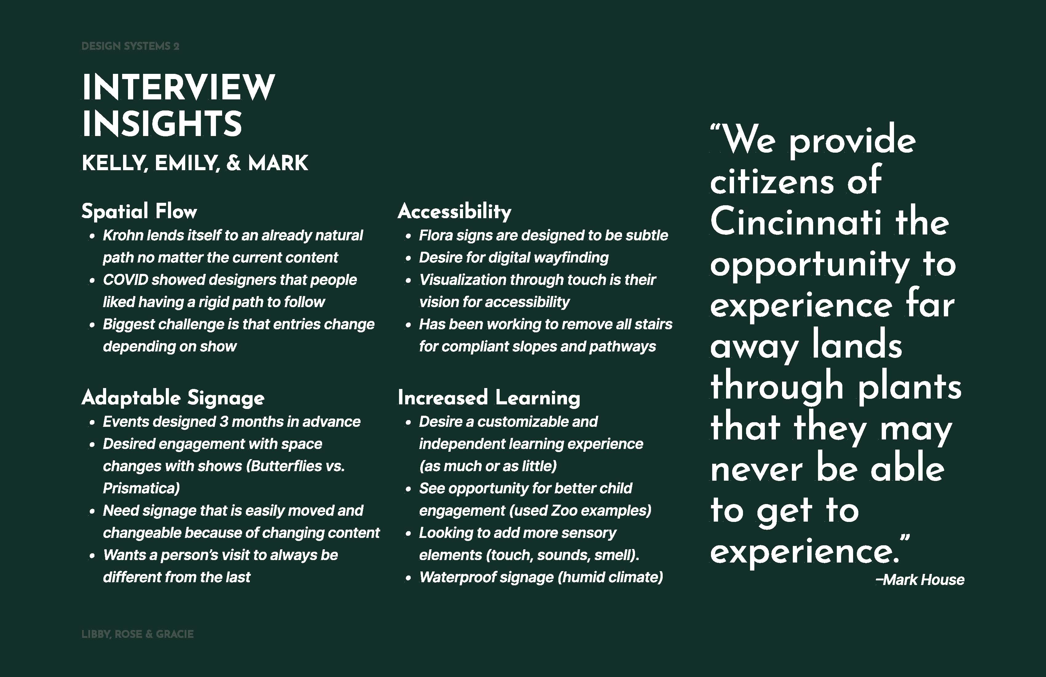
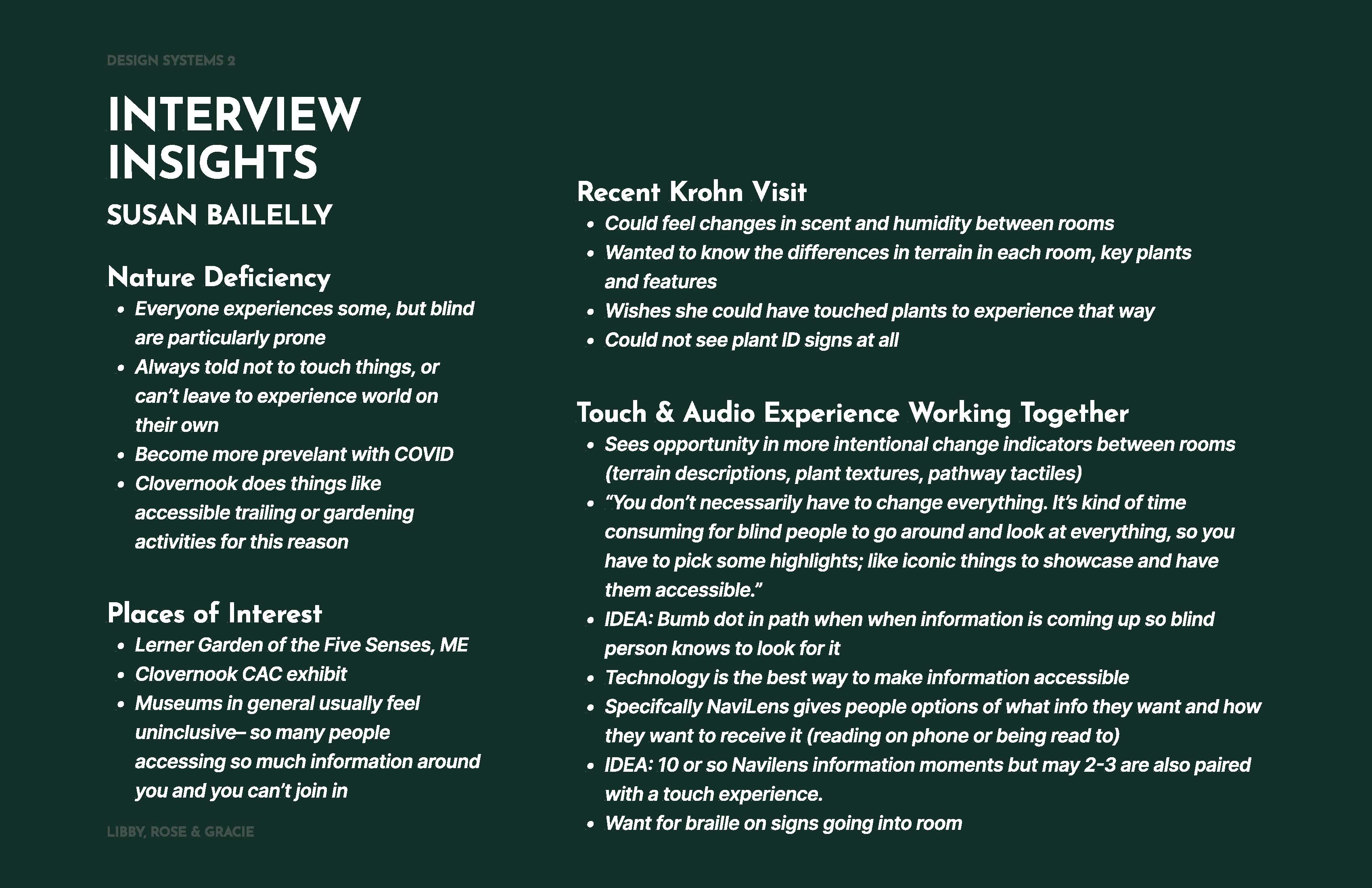
Expert Interviews
To gain more insight into the subject and current design system, we selected four experts to interview.
To gain more insight into the subject and current design system, we selected four experts to interview.

STAGE 2
Design PlanningPlanning
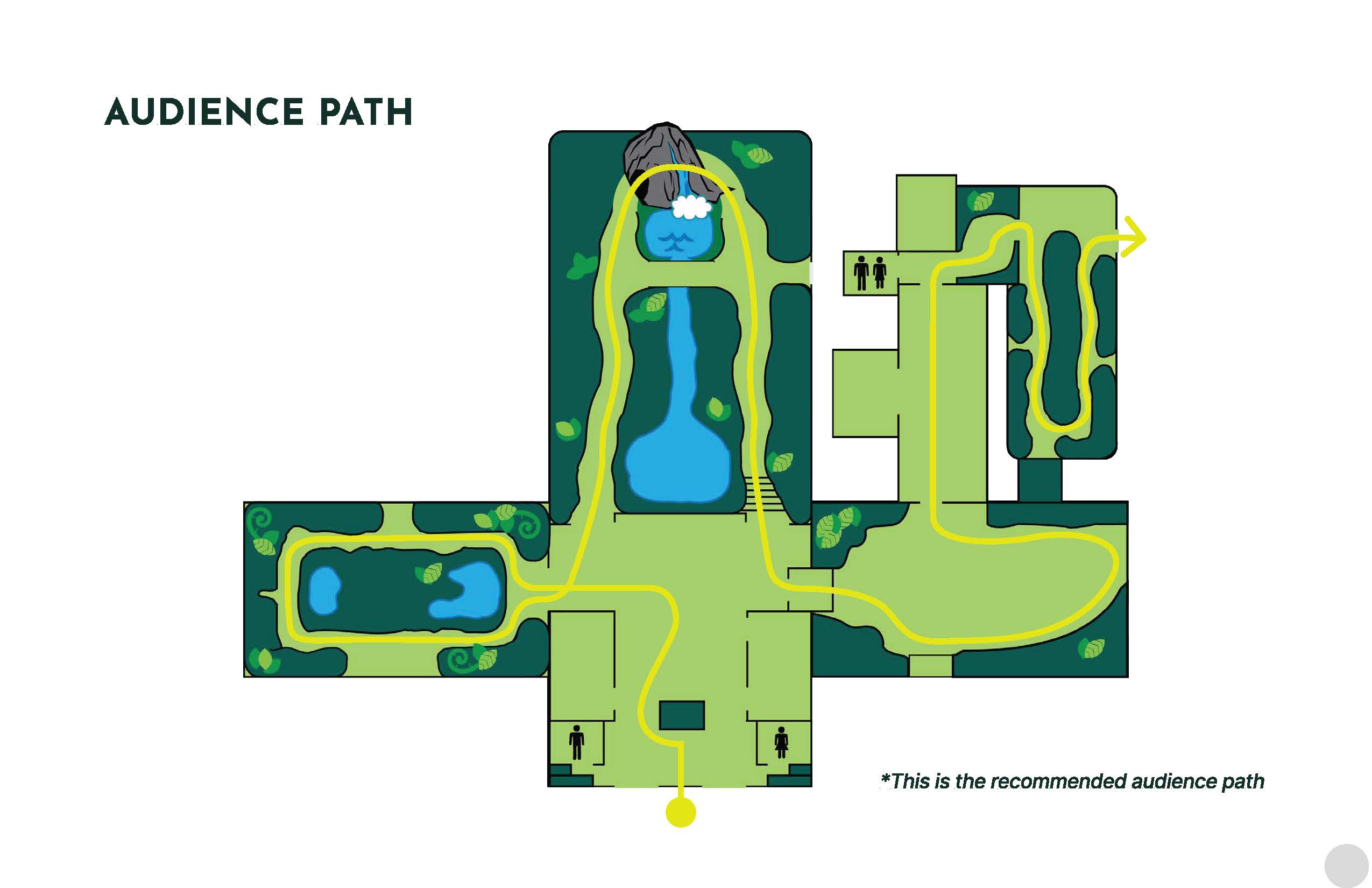
Developing the user journey htroughout the space as well as a look and feel for the design system.
Developing the user journey htroughout the space as well as a look and feel for the design system.

STAGE 3
Round 1 DesignDesign Logic
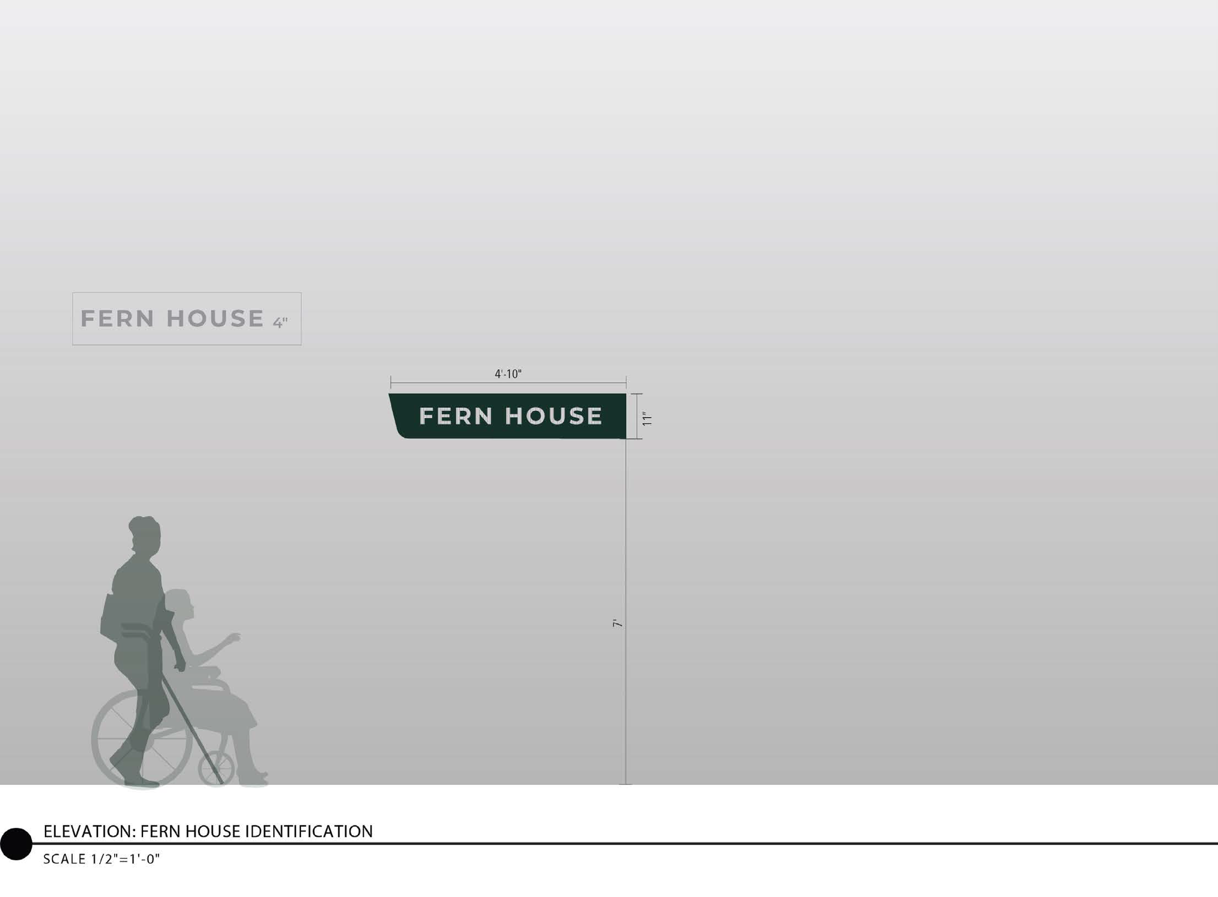
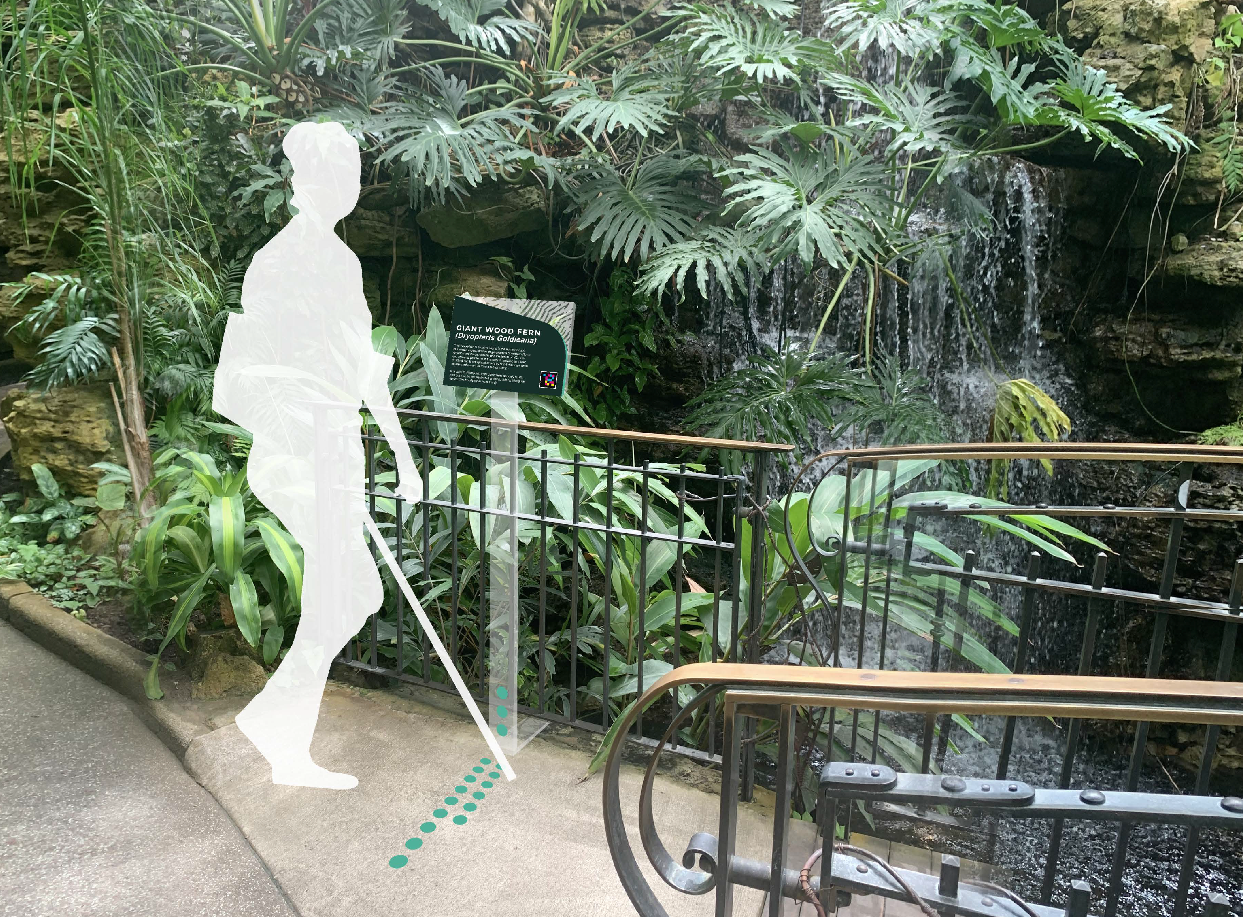
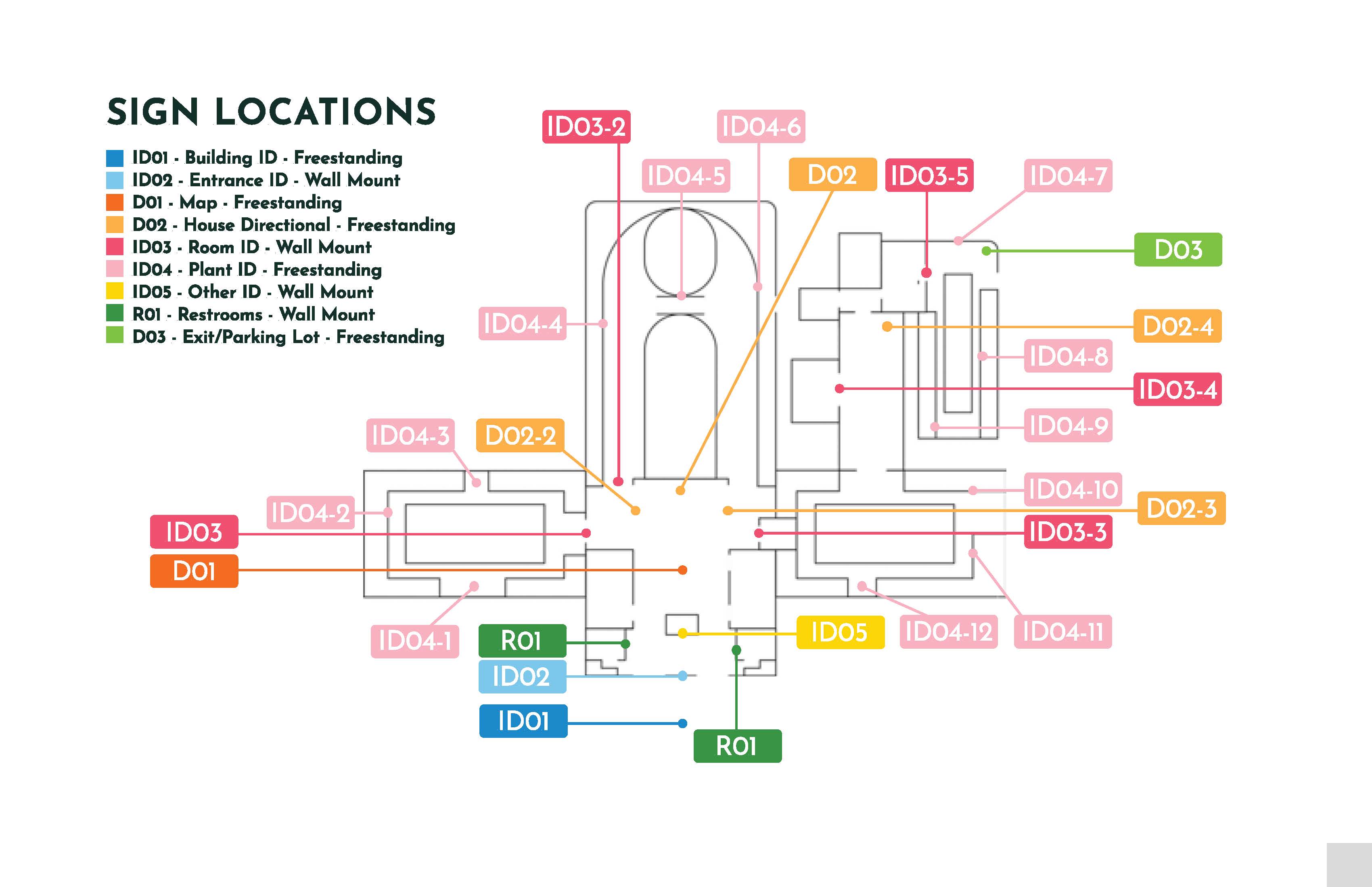
This round of design development emphasizes a multisensory and adaptable approach to wayfinding by integrating tactile textures, color coding, and accessible technology throughout. Legibility and clarity are prioritized through accessible iconography and intuitive sign placement, while material choices like clear and colored acrylic and brushed aluminum support visual clarity and durability. NaviLens codes enhance navigational support, and modular components such as movable signs, adjustable arrows, and seasonal tactile updates ensure flexibility and responsiveness to user needs and the surrounding environment. Multiple design concepts have been developed for each type of signage, allowing for thoughtful exploration of visual, spatial, and functional possibilities.
This round of design development emphasizes a multisensory and adaptable approach to wayfinding by integrating tactile textures, color coding, and accessible technology throughout. Legibility and clarity are prioritized through accessible iconography and intuitive sign placement, while material choices like clear and colored acrylic and brushed aluminum support visual clarity and durability. NaviLens codes enhance navigational support, and modular components such as movable signs, adjustable arrows, and seasonal tactile updates ensure flexibility and responsiveness to user needs and the surrounding environment. Multiple design concepts have been developed for each type of signage, allowing for thoughtful exploration of visual, spatial, and functional possibilities.


STAGE 4
Final DesignDesign Logic
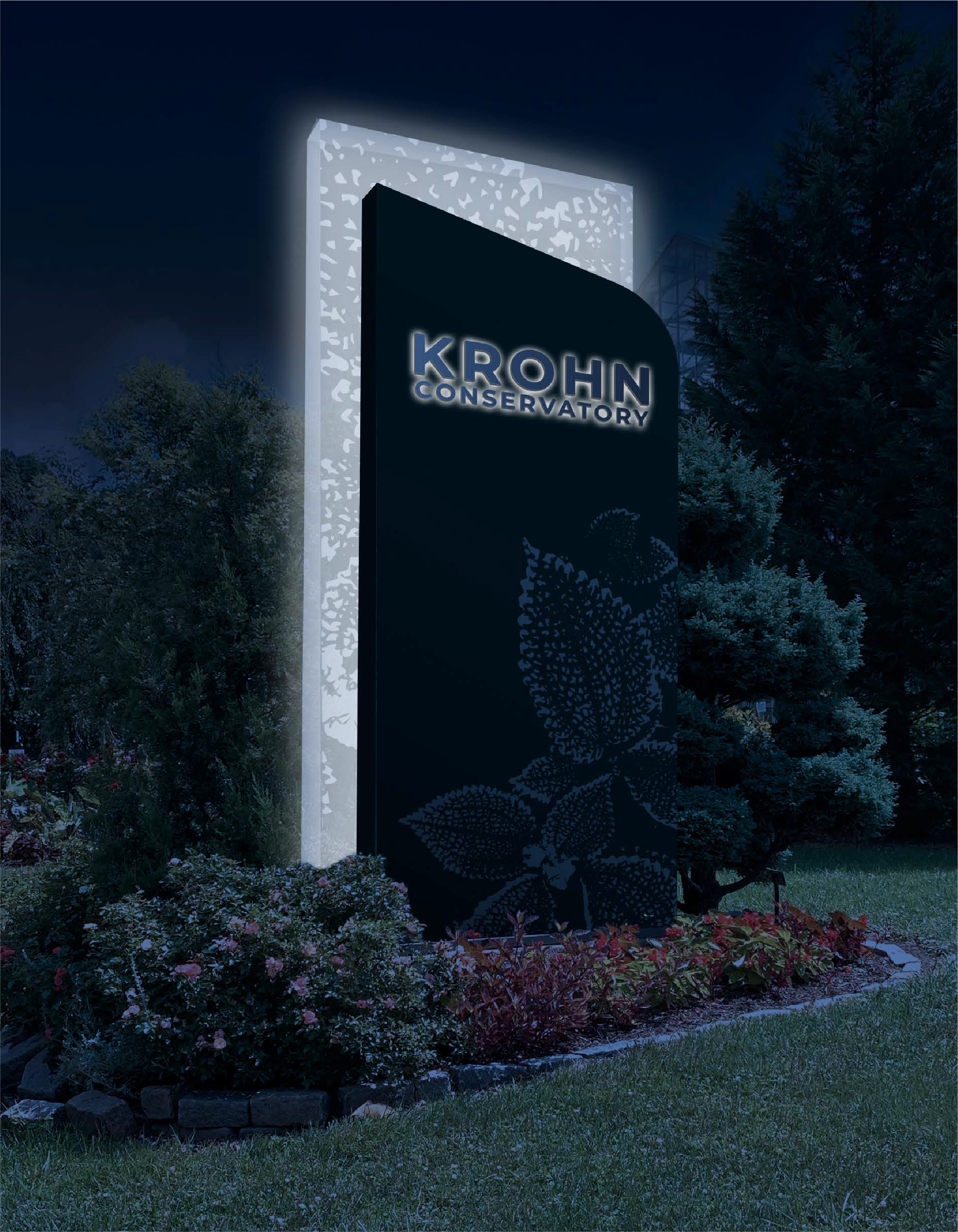
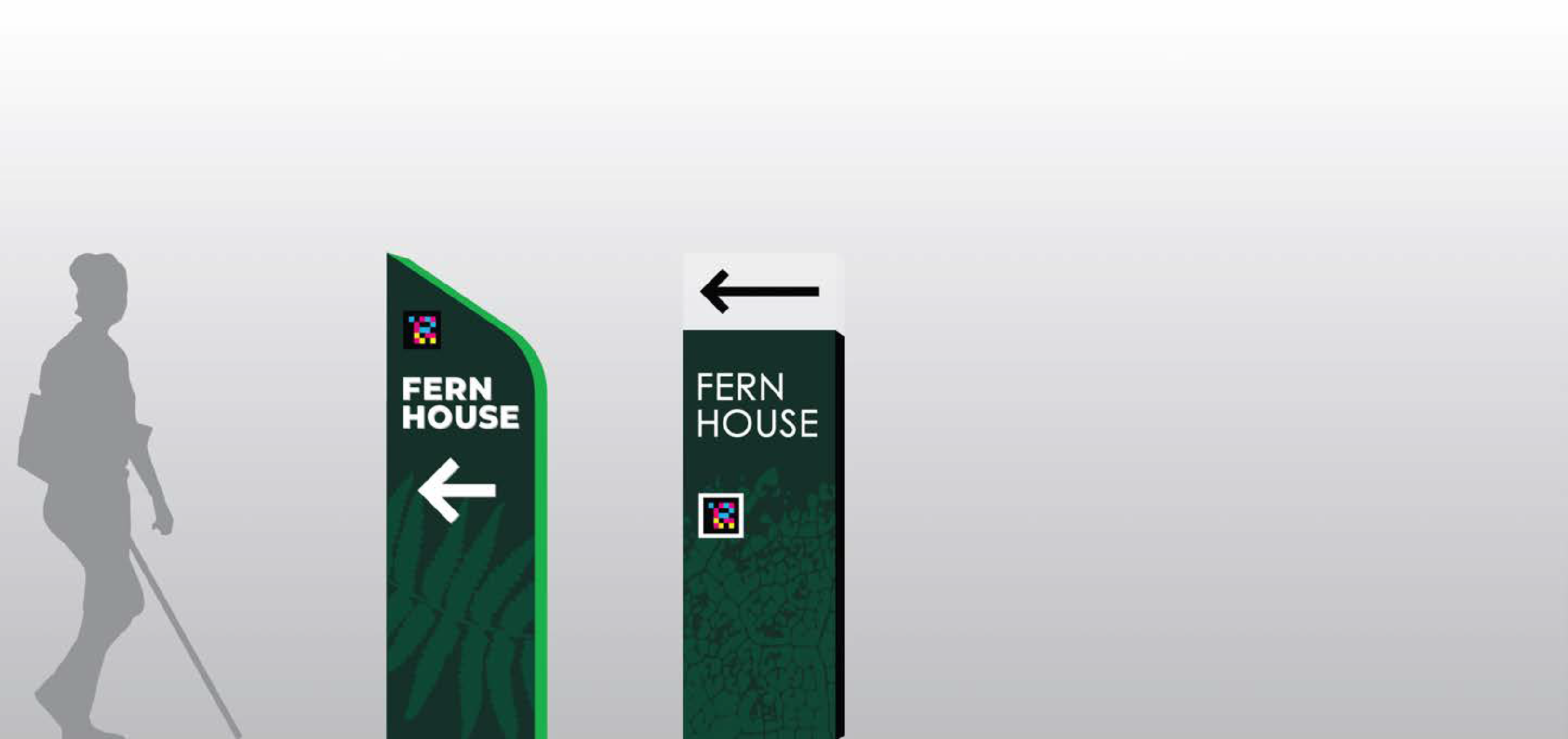
The final design system refines our multisensory and adaptable approach to wayfinding with a focus on clarity, inclusivity, and material efficiency. Tactile textures, color coding, and accessible technology remain central, while the use of clear and colored acrylic alongside brushed aluminum replaces earlier material choices to create a more durable, modern, and visually cohesive experience. Legibility is enhanced through intuitive sign placement and accessible iconography, and NaviLens codes continue to provide layered navigational support. Modular elements such as movable signage, adjustable arrows, and seasonal tactile features ensure the system remains flexible and responsive to evolving spatial and user needs.
The final design system refines our multisensory and adaptable approach to wayfinding with a focus on clarity, inclusivity, and material efficiency. Tactile textures, color coding, and accessible technology remain central, while the use of clear and colored acrylic alongside brushed aluminum replaces earlier material choices to create a more durable, modern, and visually cohesive experience. Legibility is enhanced through intuitive sign placement and accessible iconography, and NaviLens codes continue to provide layered navigational support. Modular elements such as movable signage, adjustable arrows, and seasonal tactile features ensure the system remains flexible and responsive to evolving spatial and user needs.