MIGHT
The Challenge
Stereotypical femininity manifests in pink, floral quietness. The patriarchy portrays women as well-dressed background figures.
The Solution
A publication that breaks the norms of what feminine looks like. Might is the uncensored insertion of women’s voices into the male-dominated conversations that surround current social and political issues.

Contents
This magazine contains two articles
This magazine contains two articles
Article 1:
Feature article, “Women in Lockdown”
Feature article, “Women in Lockdown”
Article 2:
Interview article, “The Women’s March”
Interview article, “The Women’s March”
PROCESS
Discovering the ProblemTypography Explorations
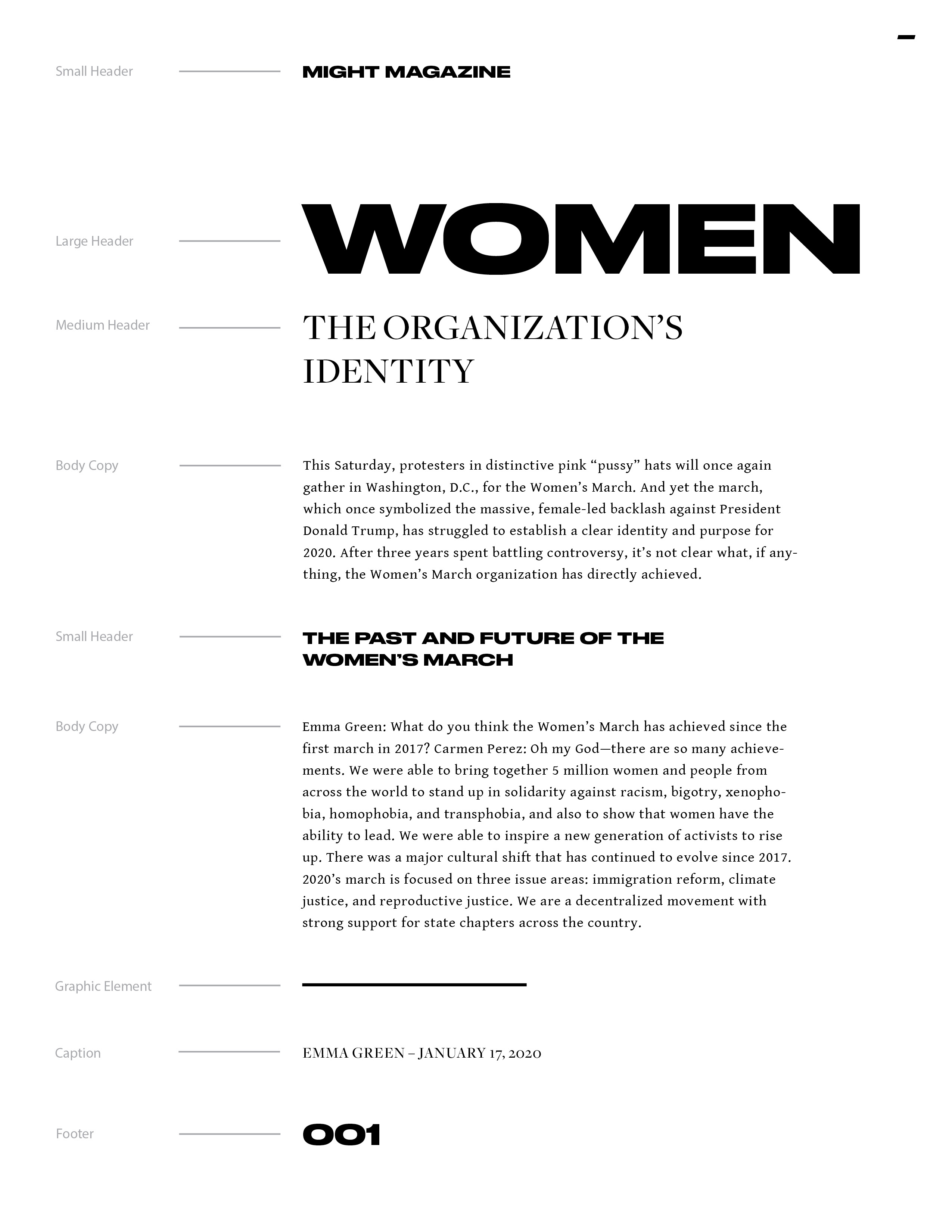
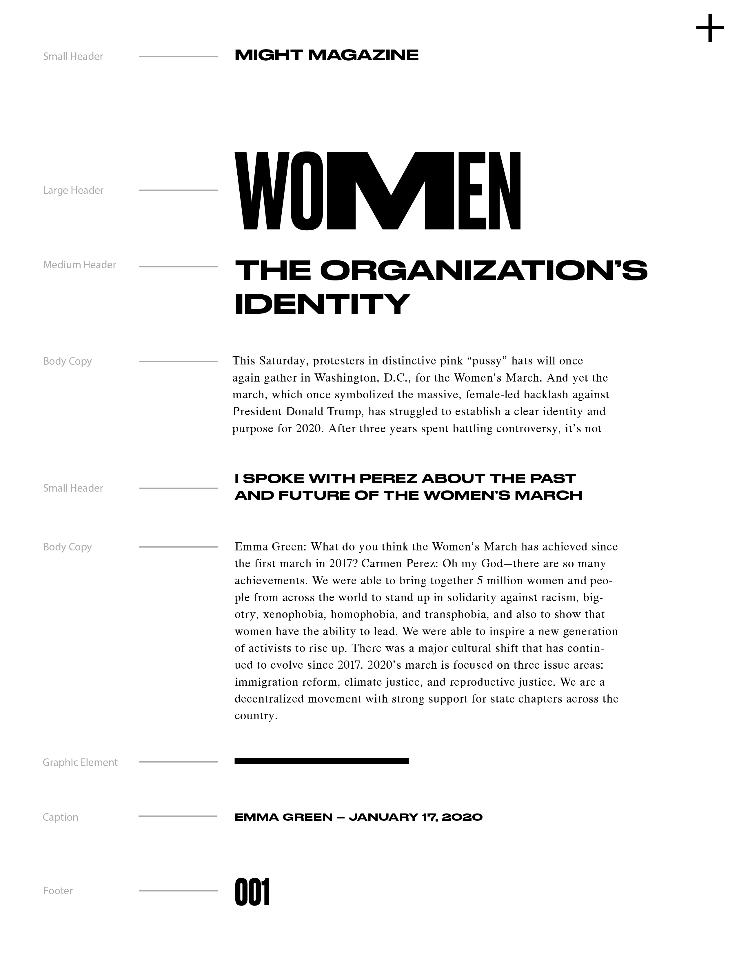
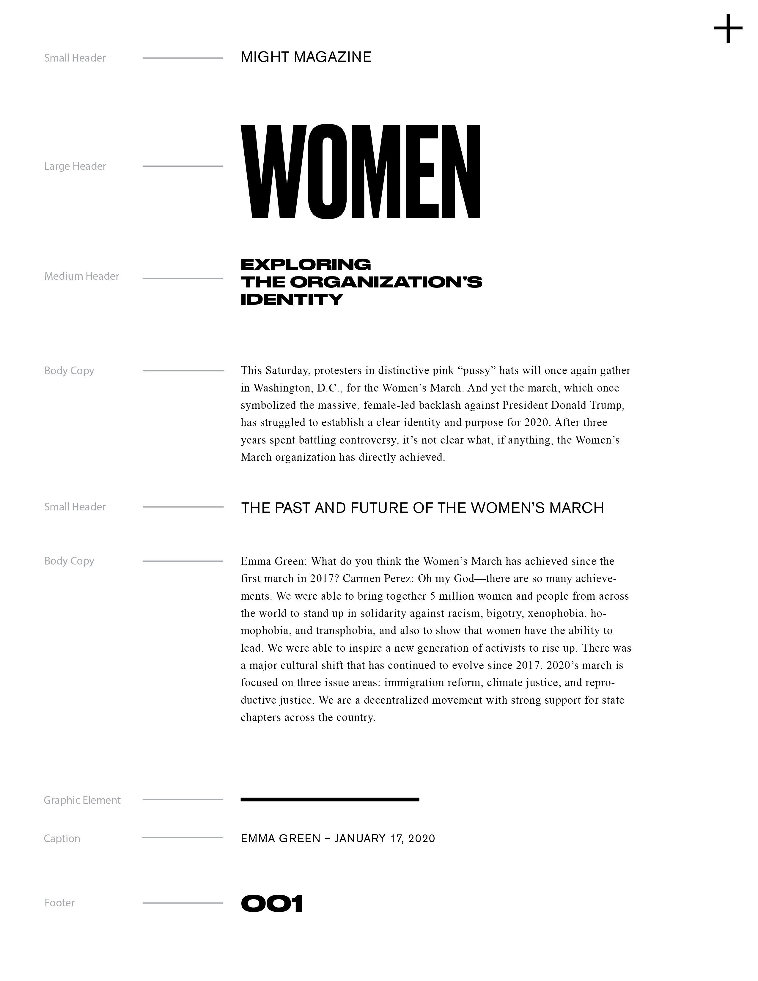
Typeface combinations focus on conveying strength through contrast.
Typeface combinations focus on conveying strength through contrast.

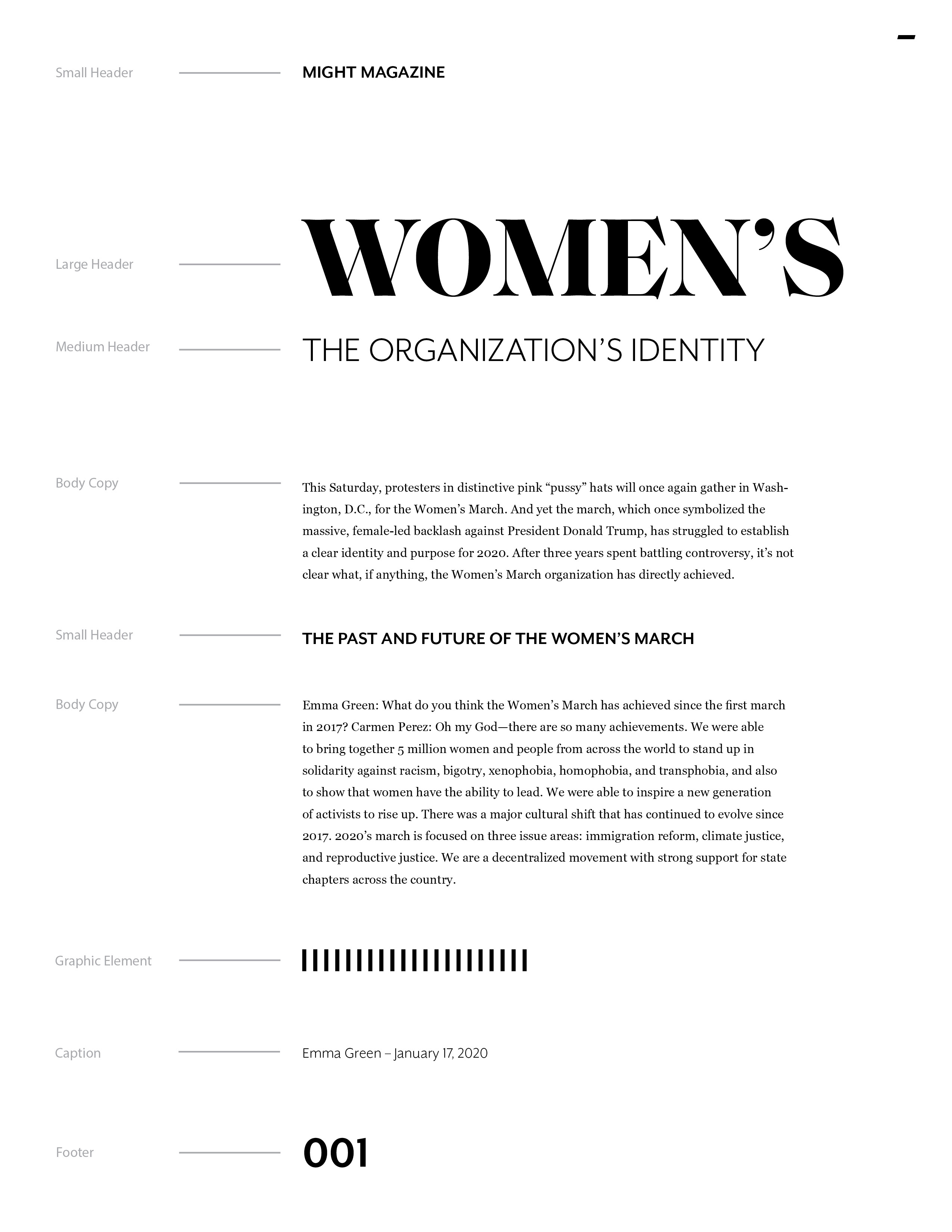

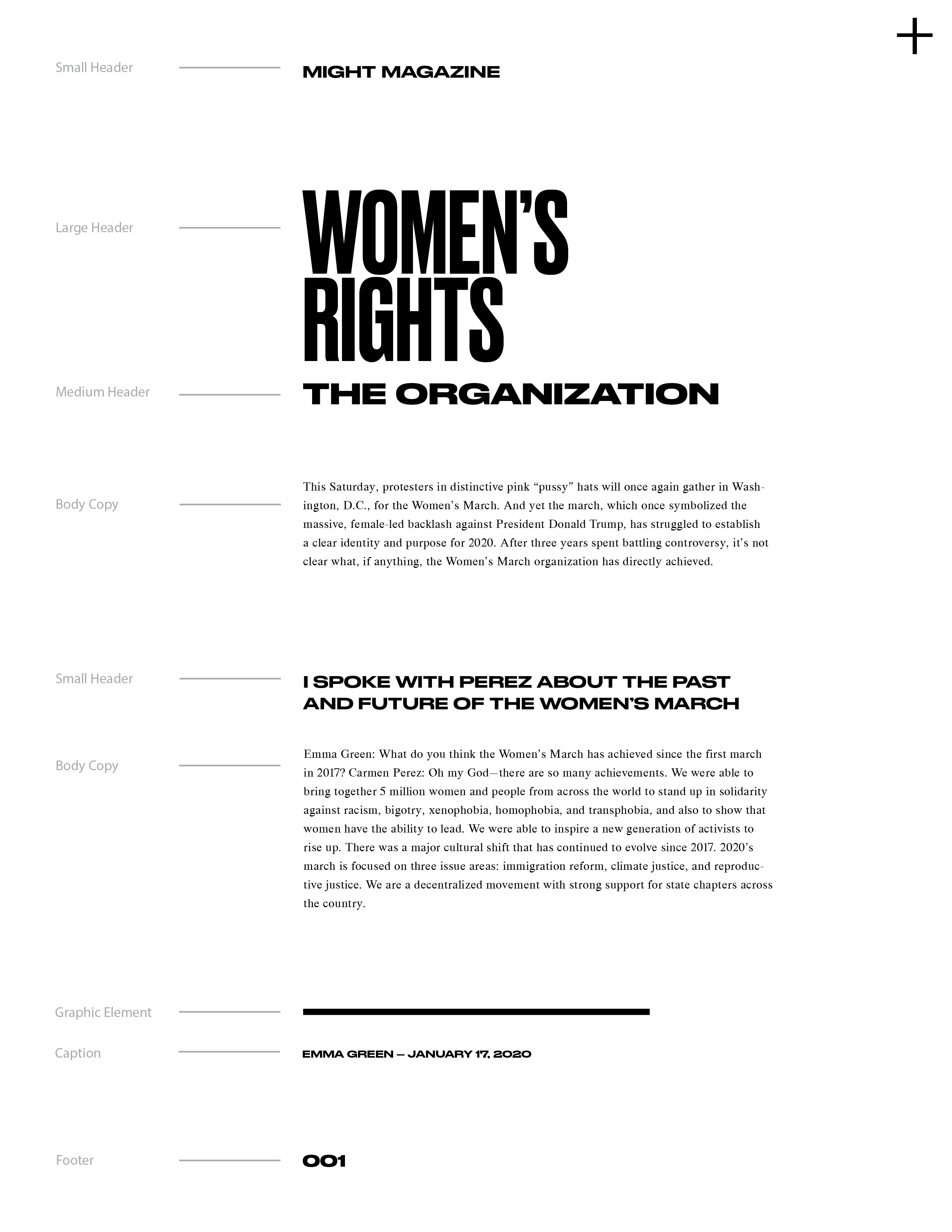

Layout Explorations Version 1 (Gallery)
Pairing wide and condensed type within titles and quotes with large leading.
Pairing wide and condensed type within titles and quotes with large leading.
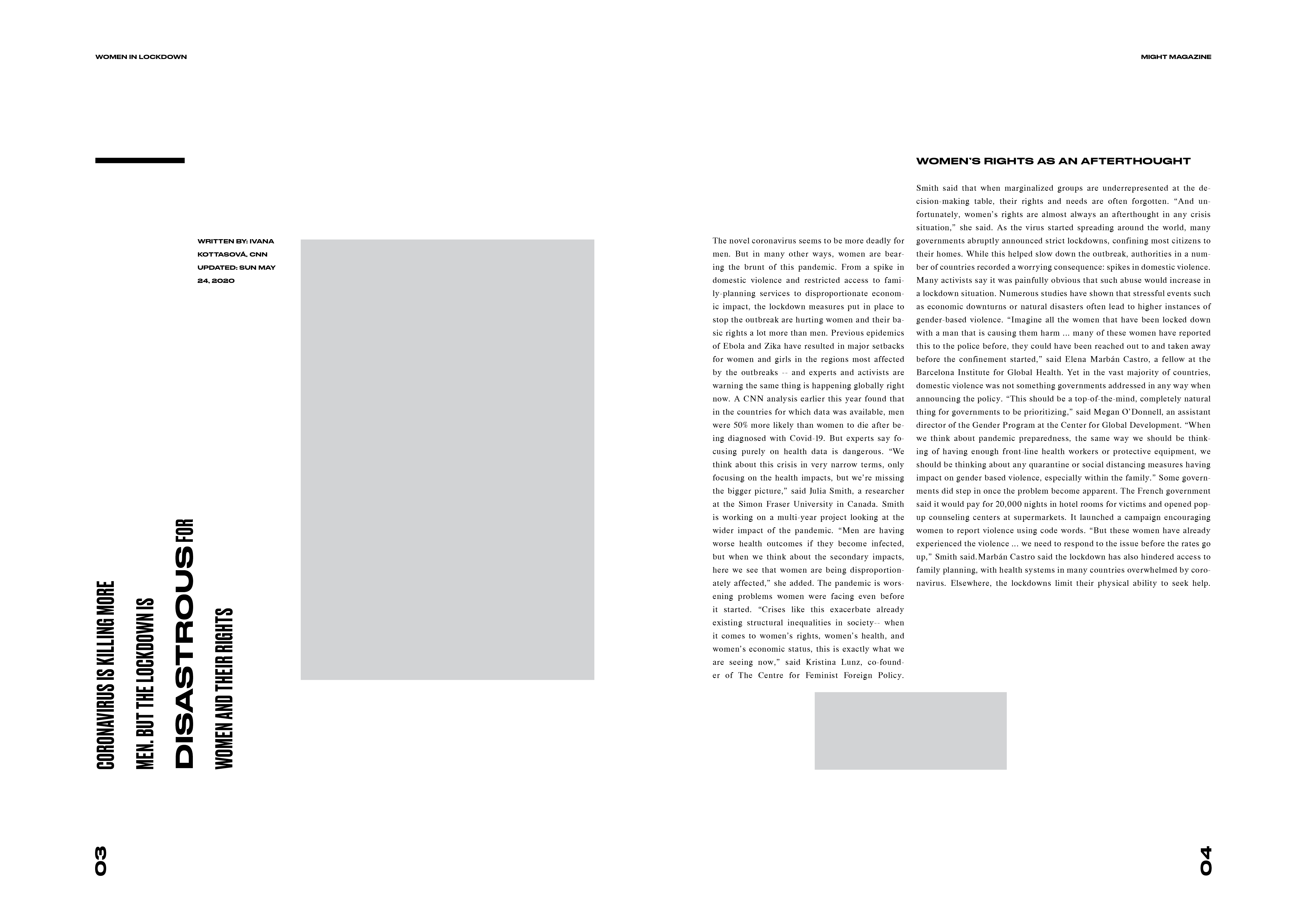
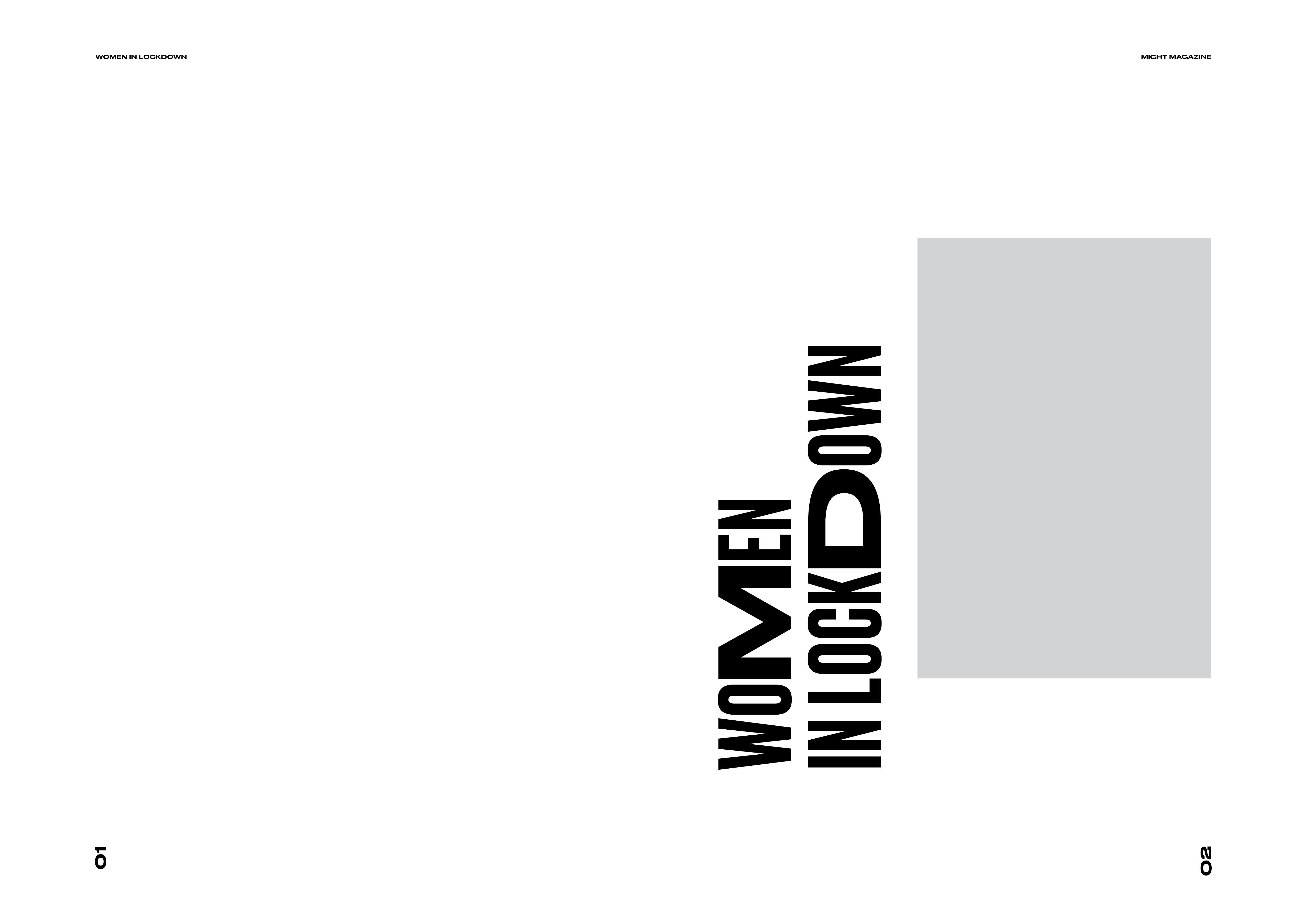
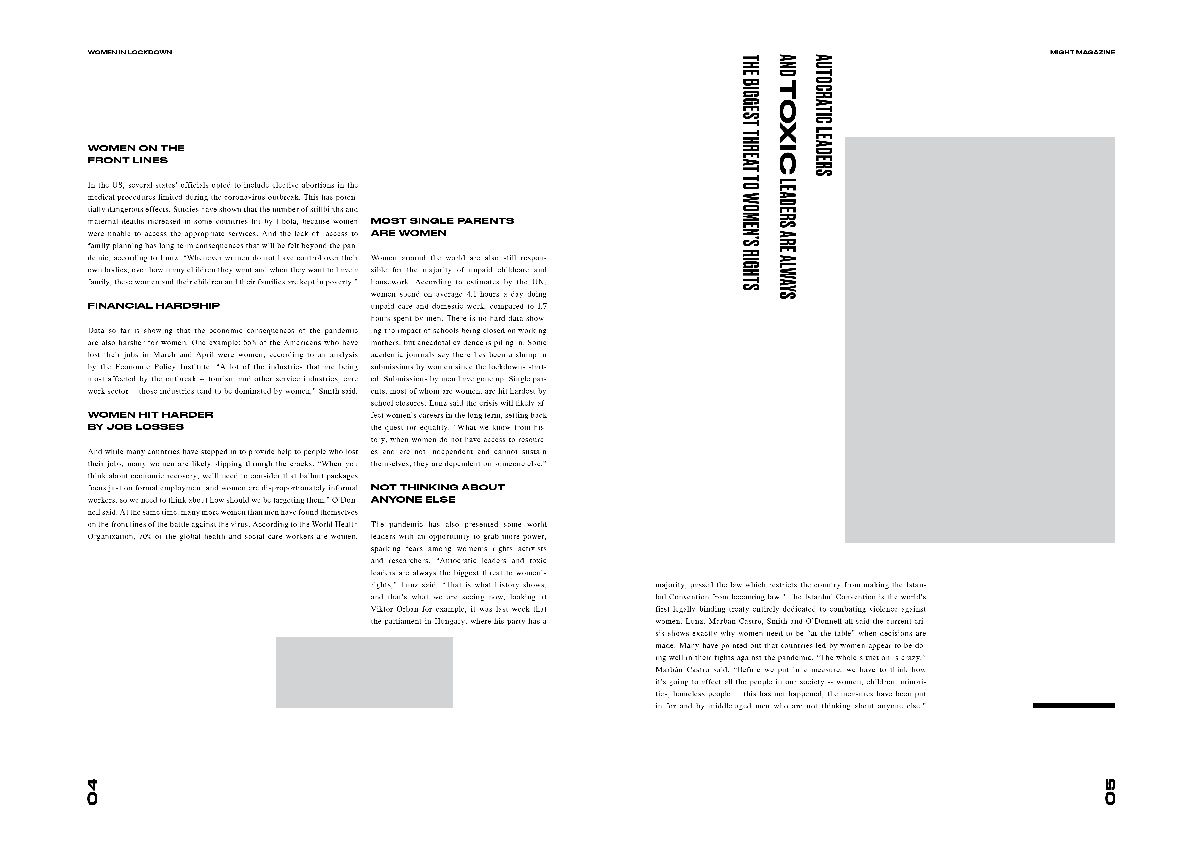
Layout Explorations Version 2 (Gallery)
Pairing wide titles with condensed subtitles.
Pairing wide titles with condensed subtitles.


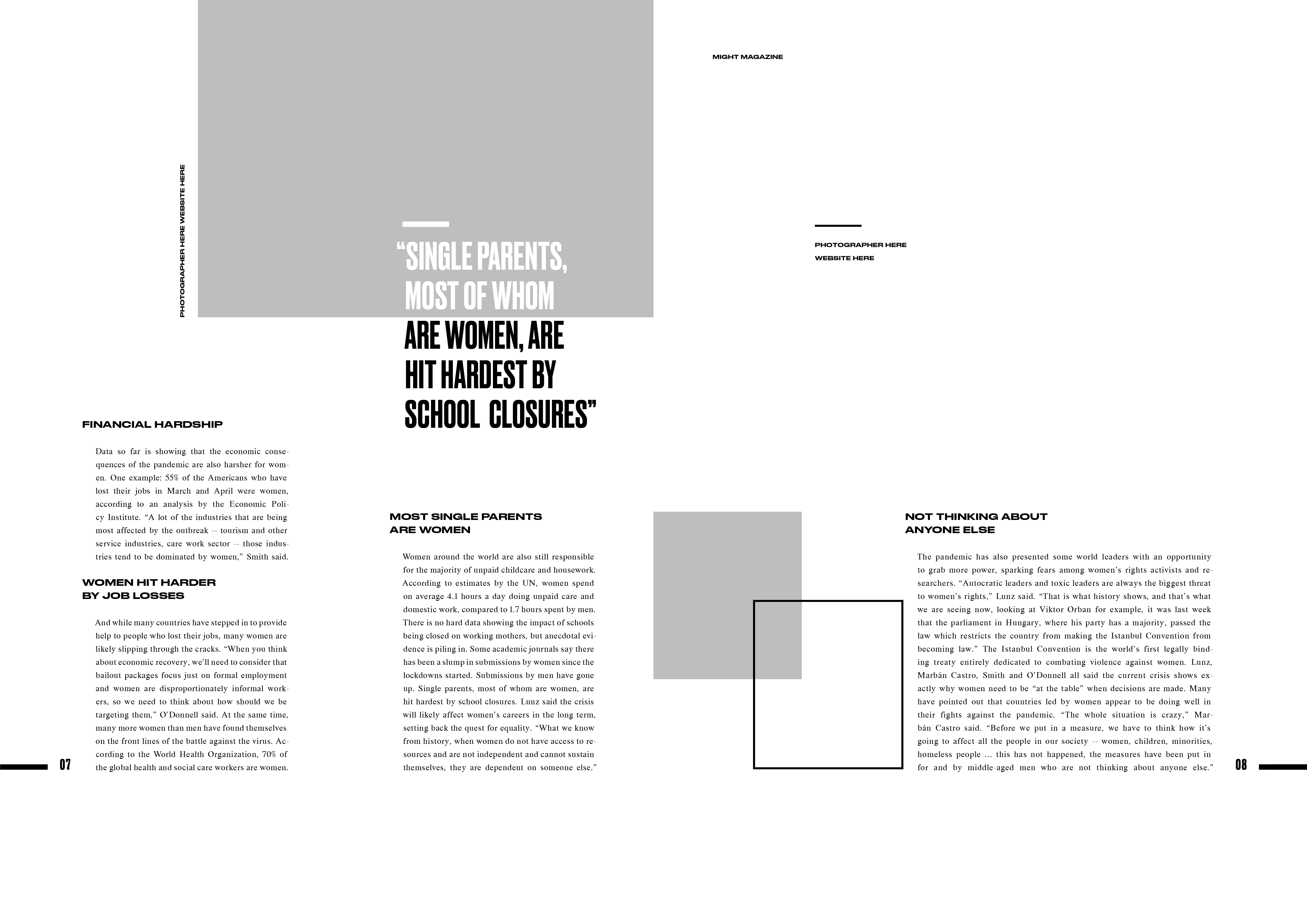
Layout Explorations Version 3 (Gallery)
Pairing wide and condensed type within titles.
Pairing wide and condensed type within titles.

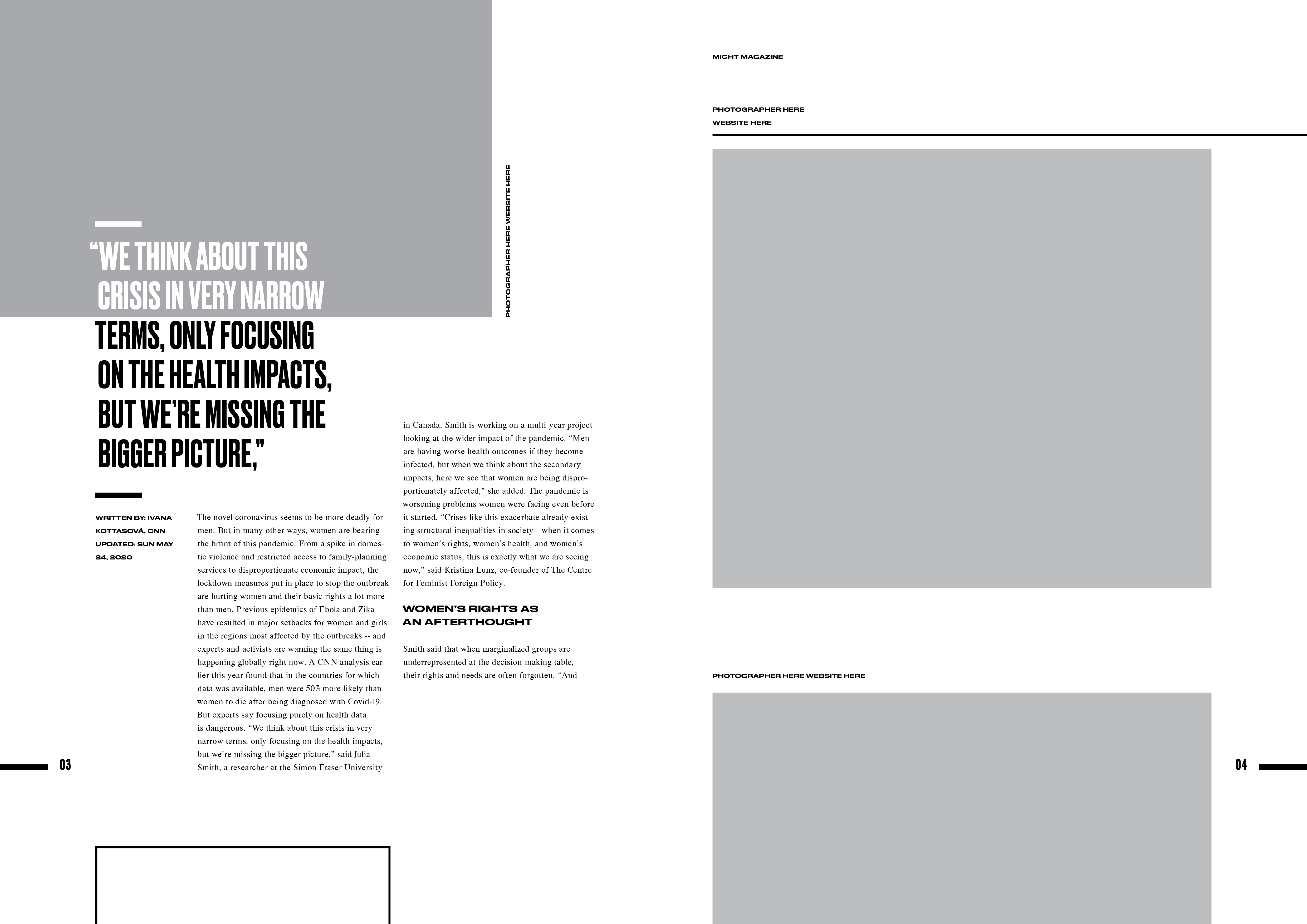
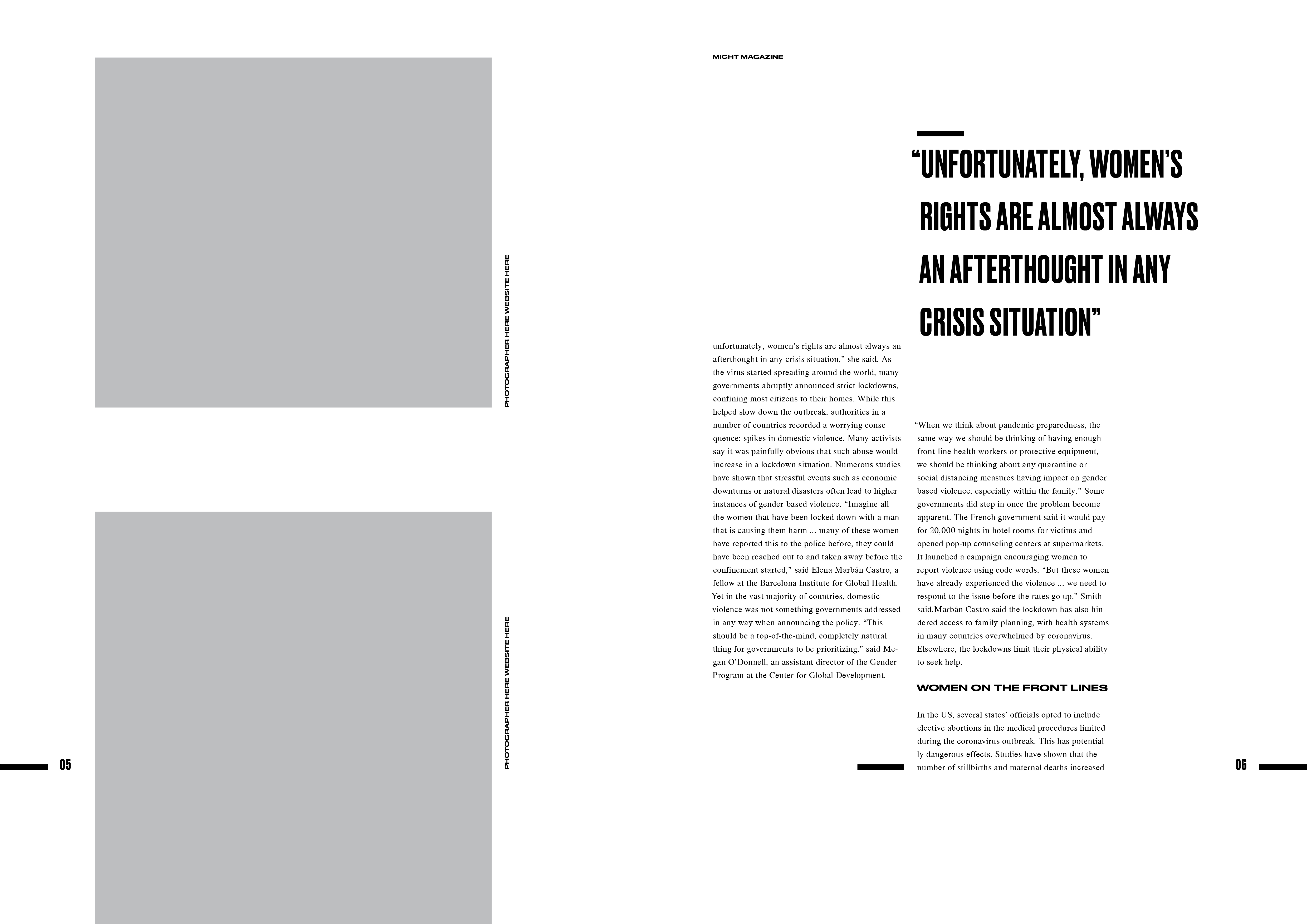
Layout Explorations Version 4 (Gallery)
Pairing wide and condensed type within titles and quotes.
Pairing wide and condensed type within titles and quotes.
Cover Design
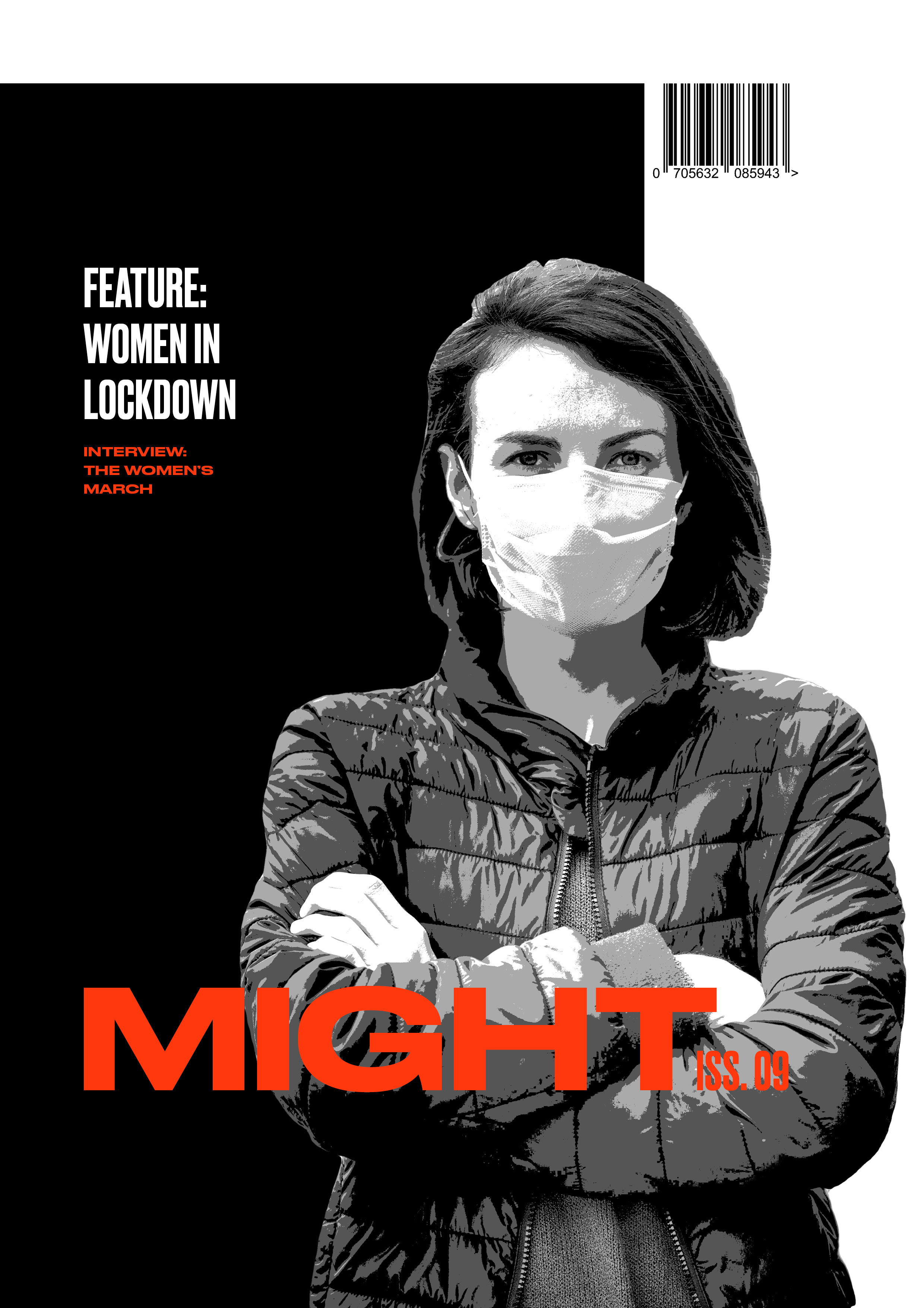
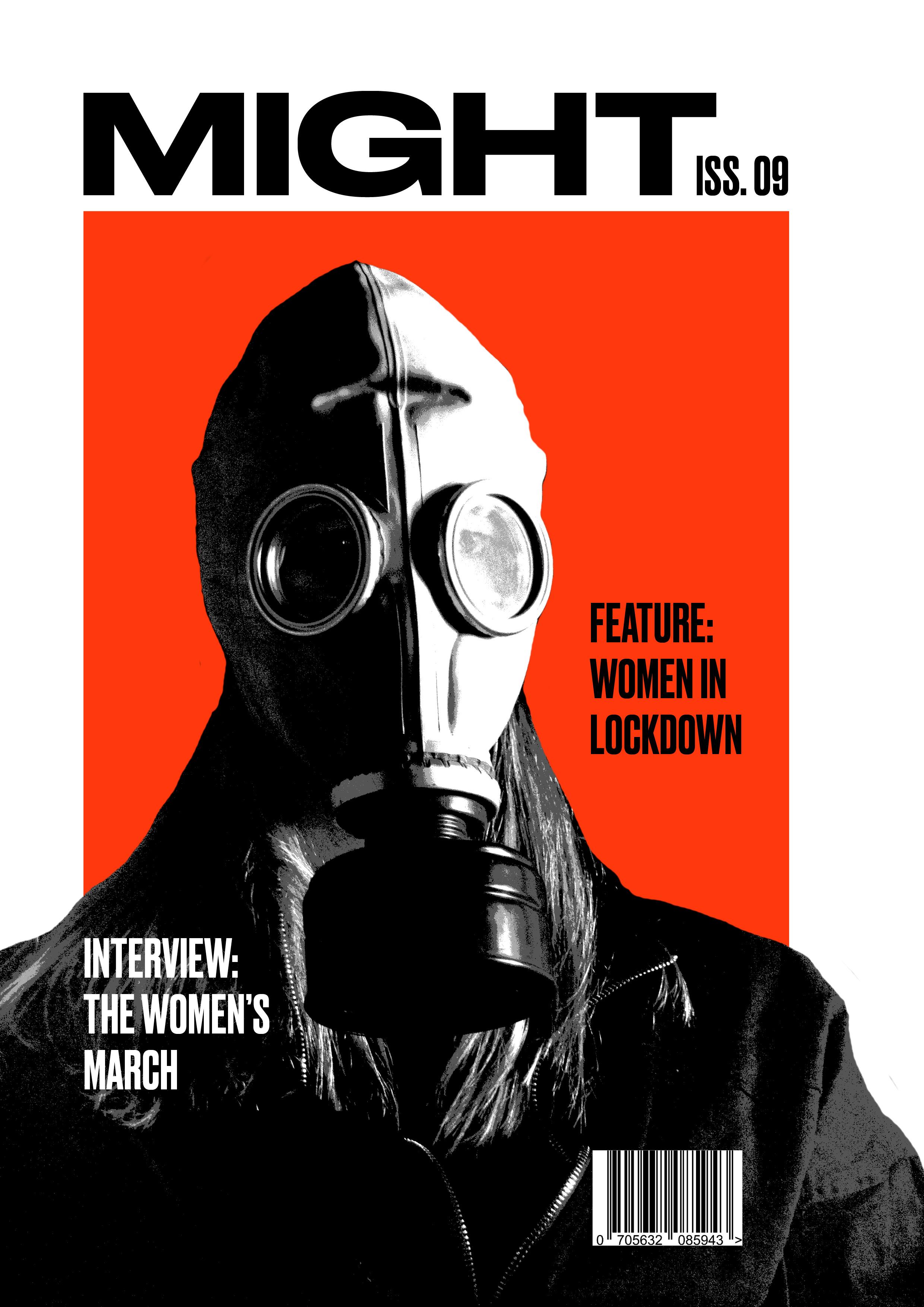
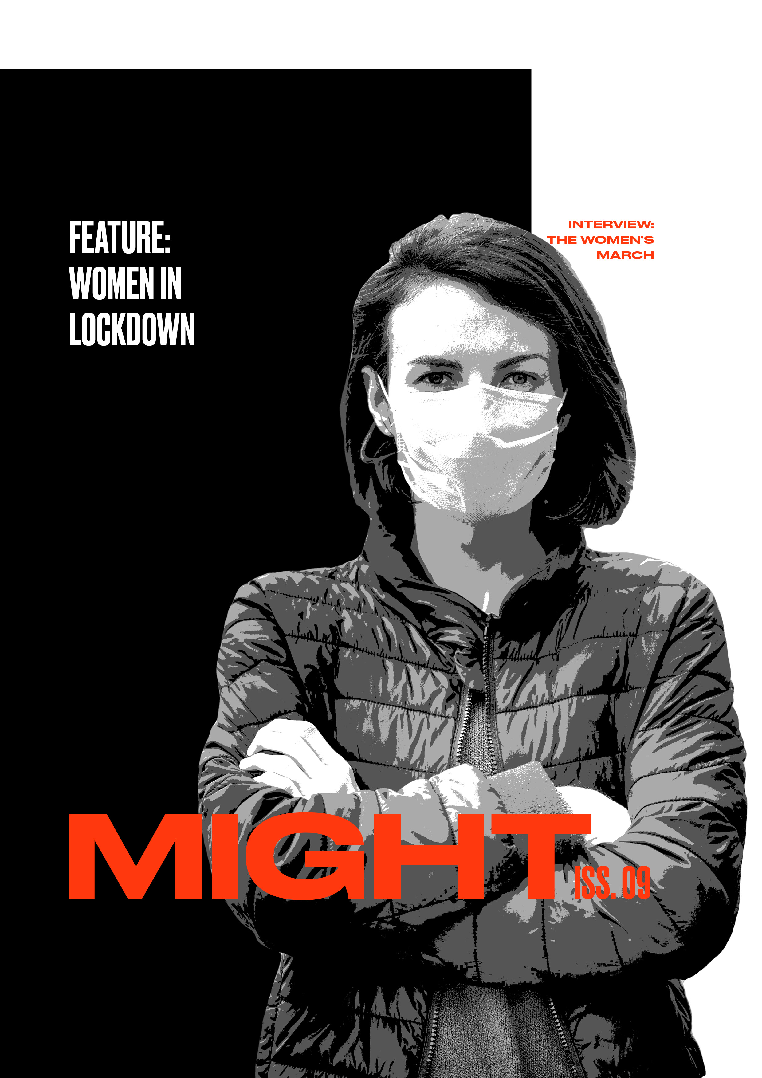
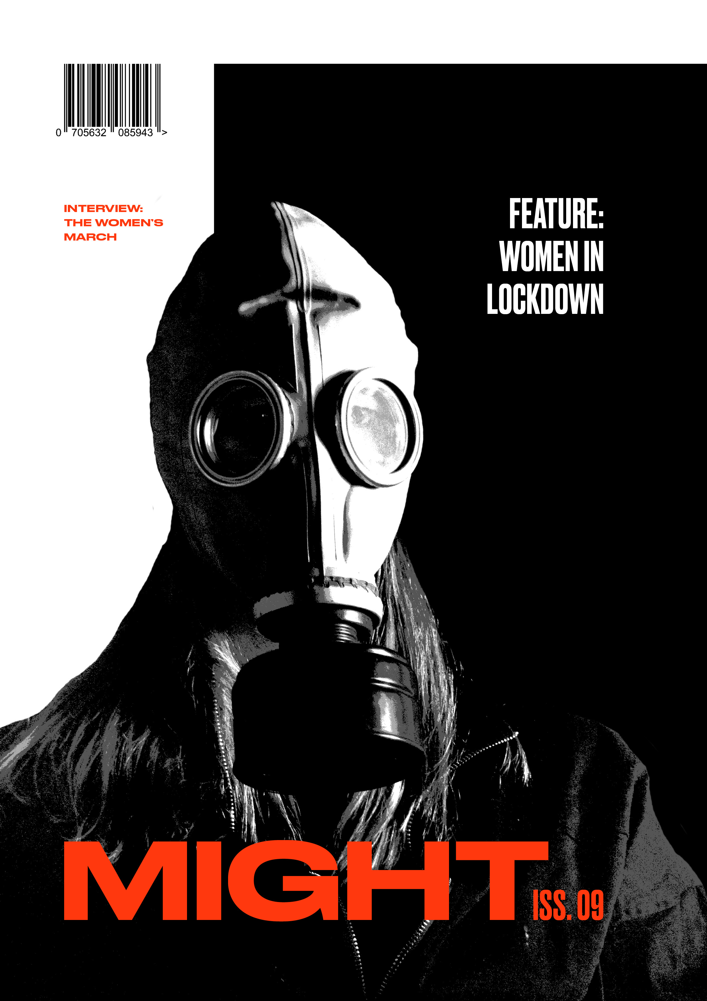
With the intention of marrying elements from both articles, cover explorations play with proportions of color and alignment of type.
With the intention of marrying elements from both articles, cover explorations play with proportions of color and alignment of type.
FINAL
Defining the ProblemFinal Typography
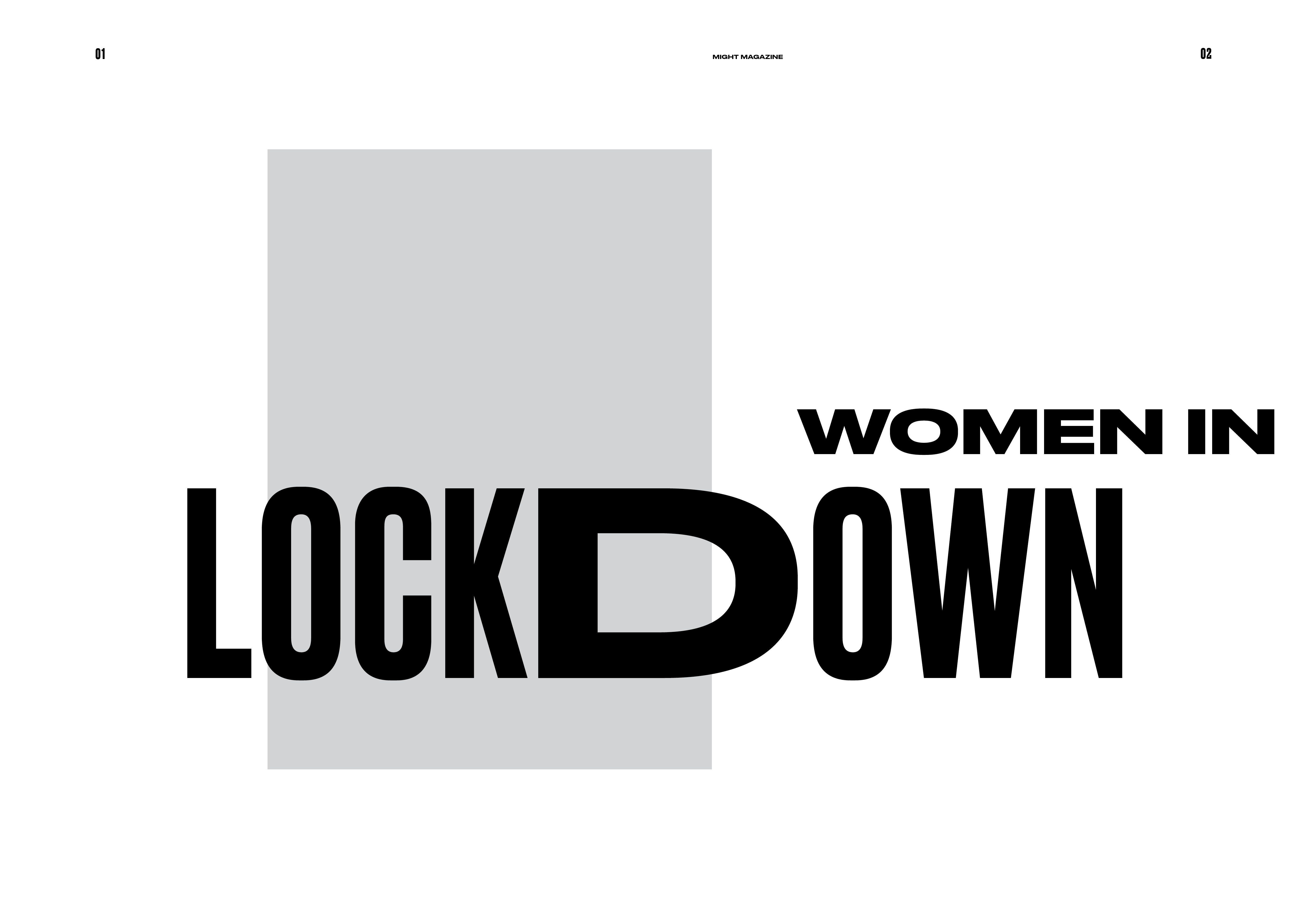
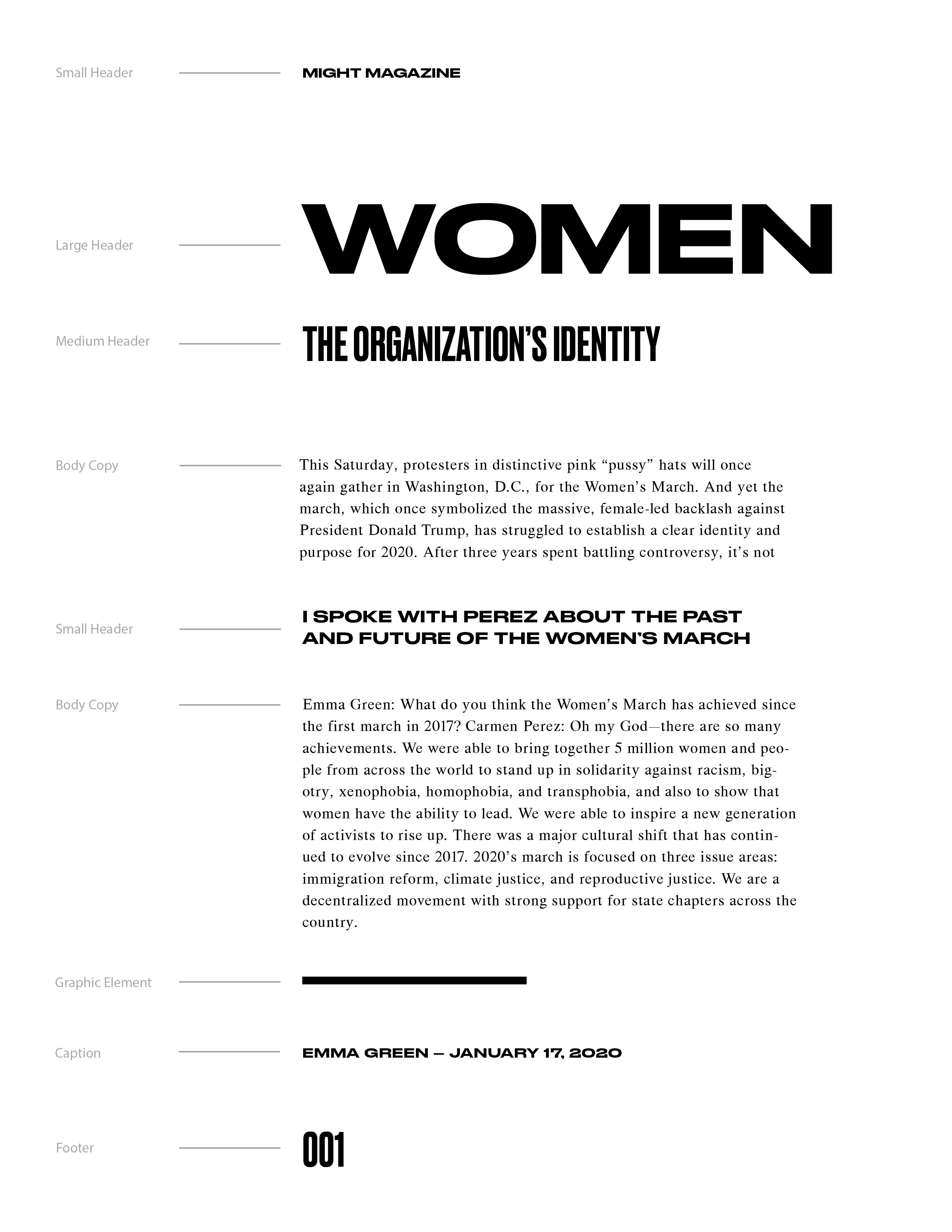
The contrast between Druk Wide and Druk Condensed speaks to a sense of conflict, while having both typefaces come from a single family provides visual harmony.
The contrast between Druk Wide and Druk Condensed speaks to a sense of conflict, while having both typefaces come from a single family provides visual harmony.
Final Spreads
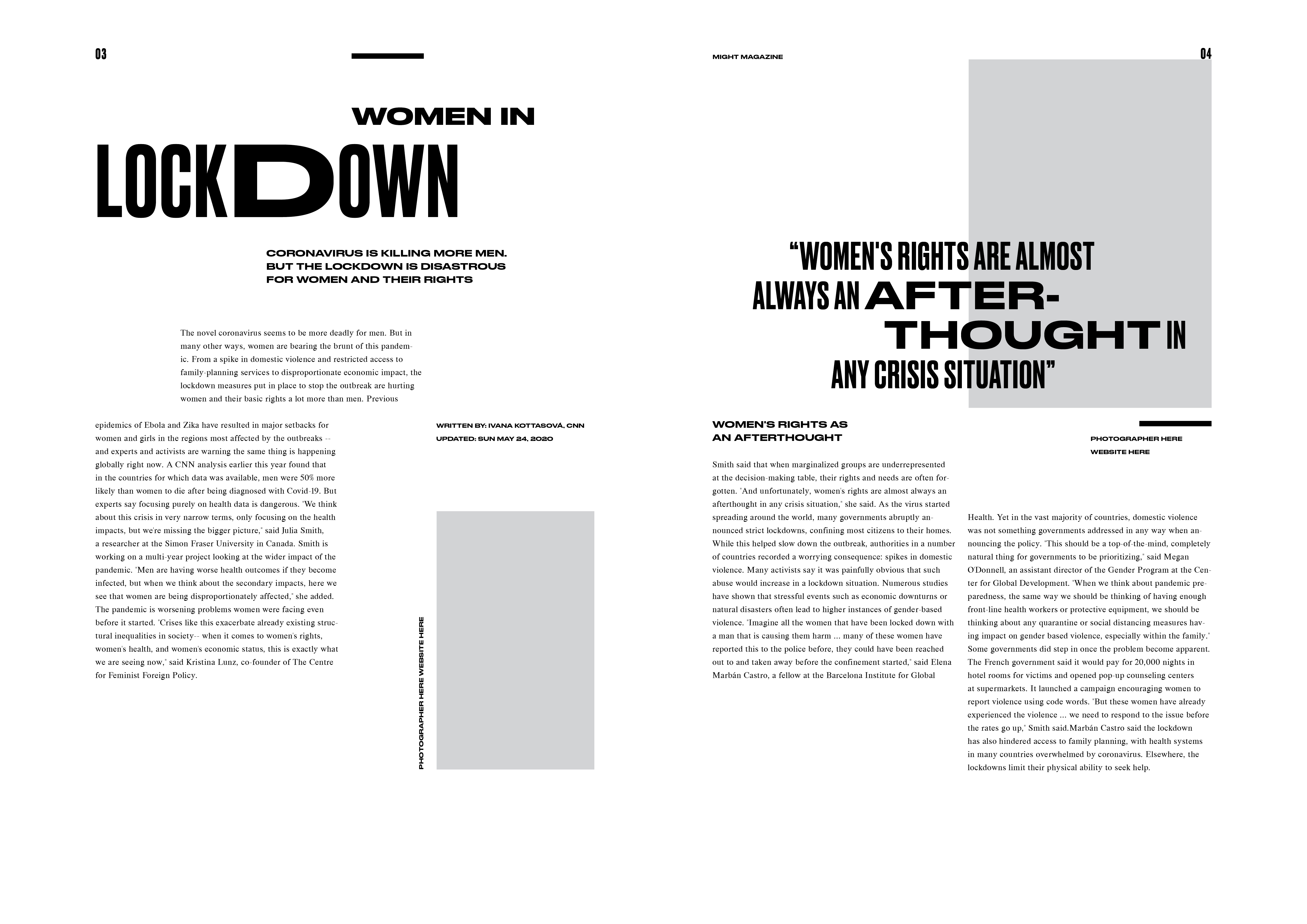
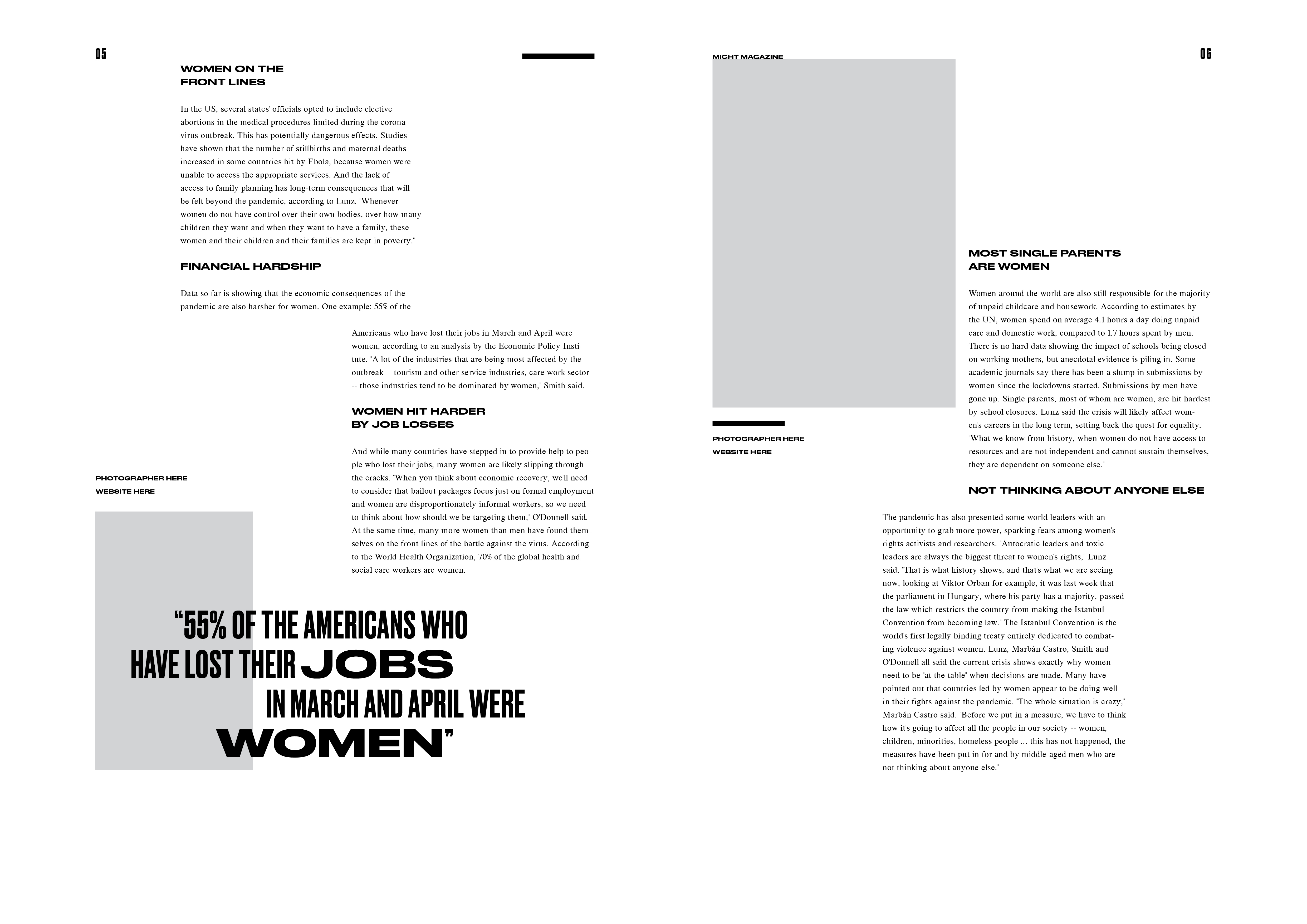
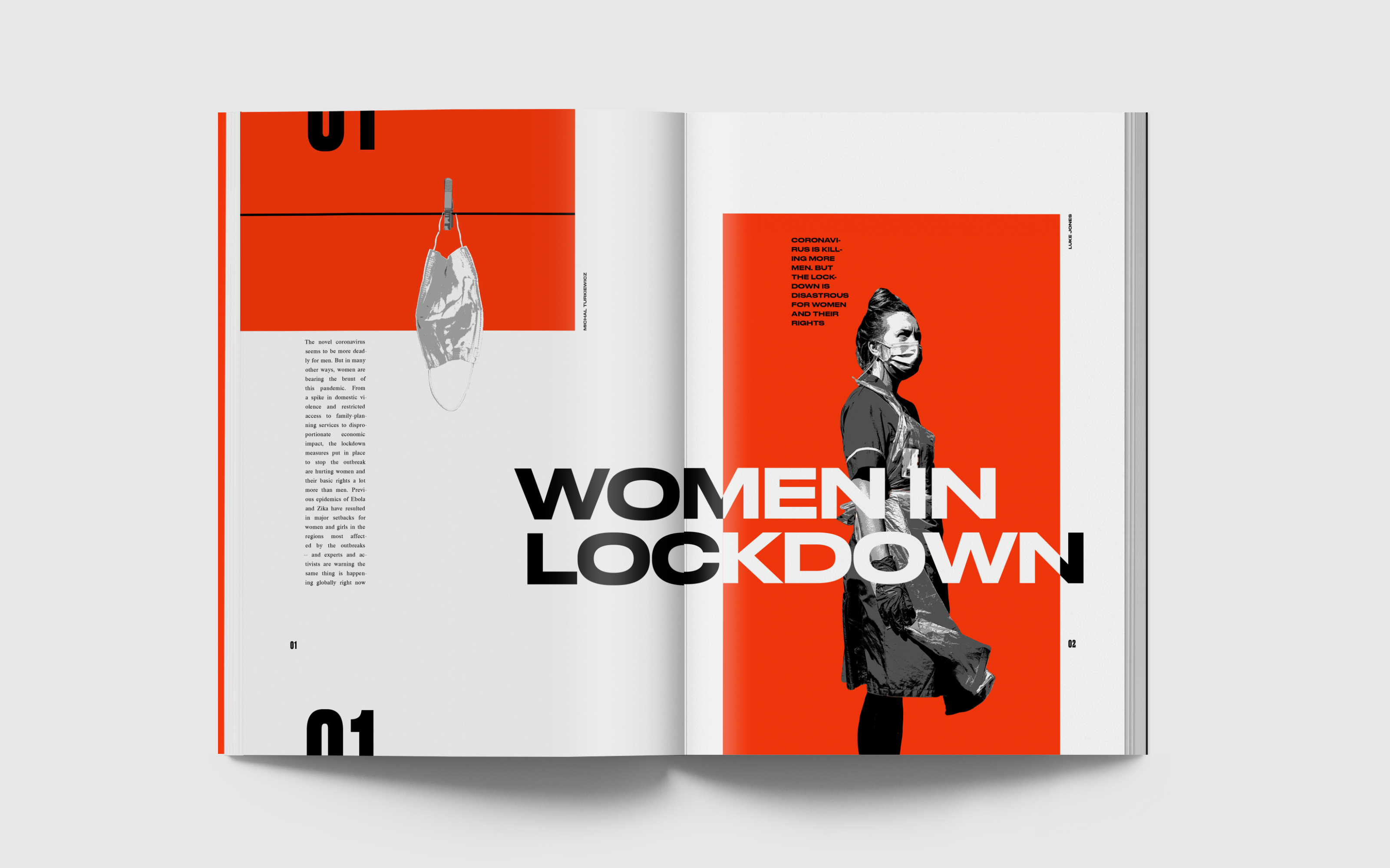
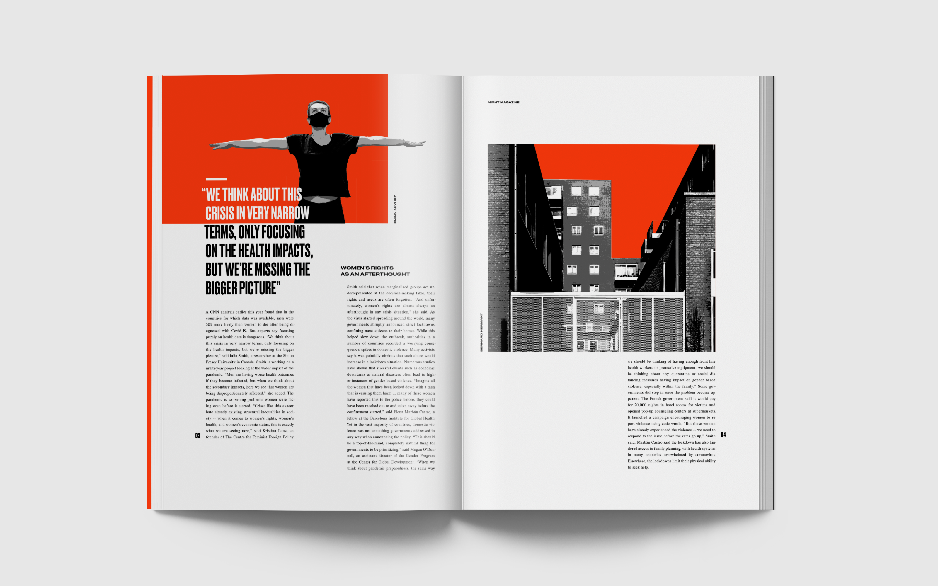
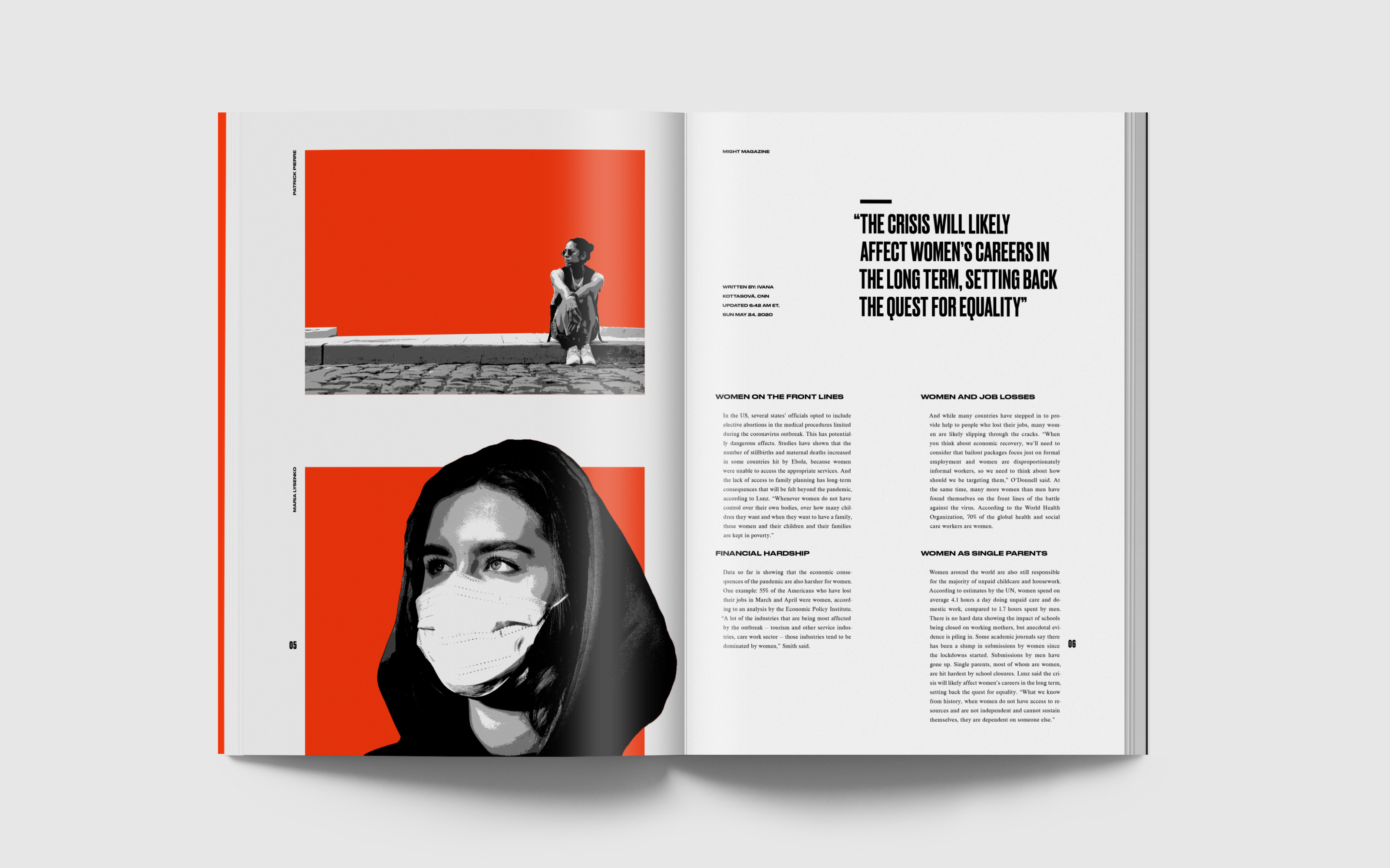
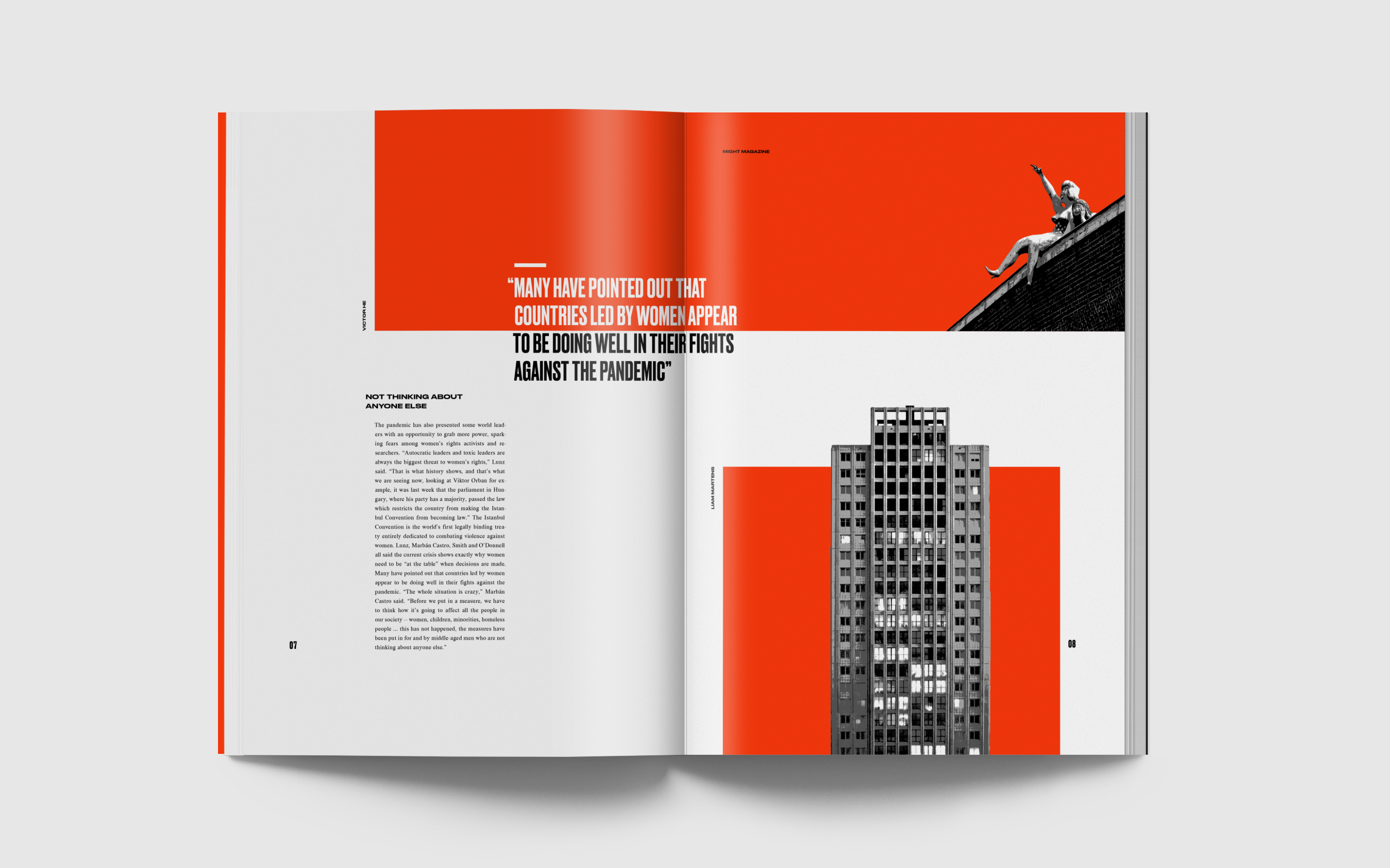
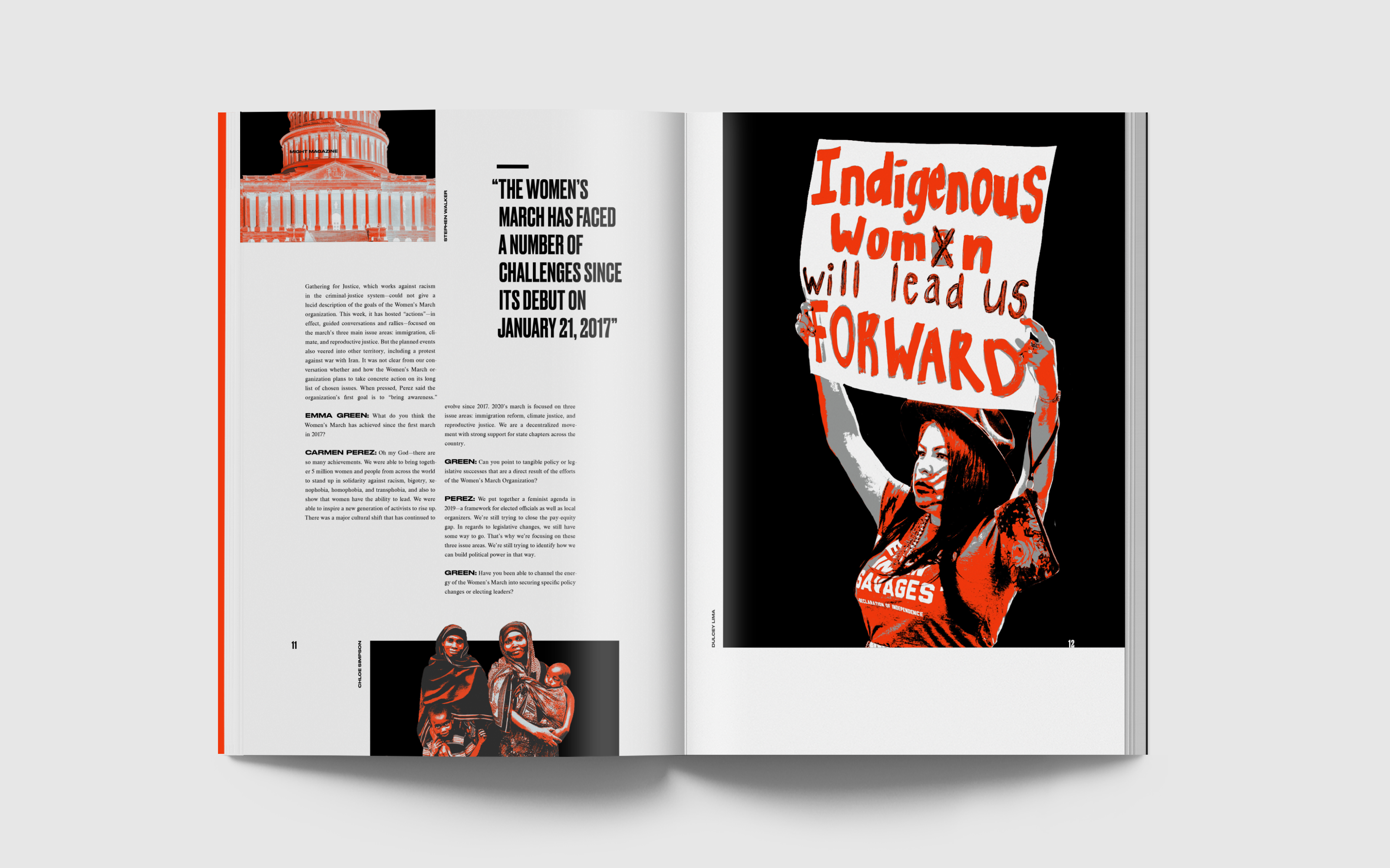
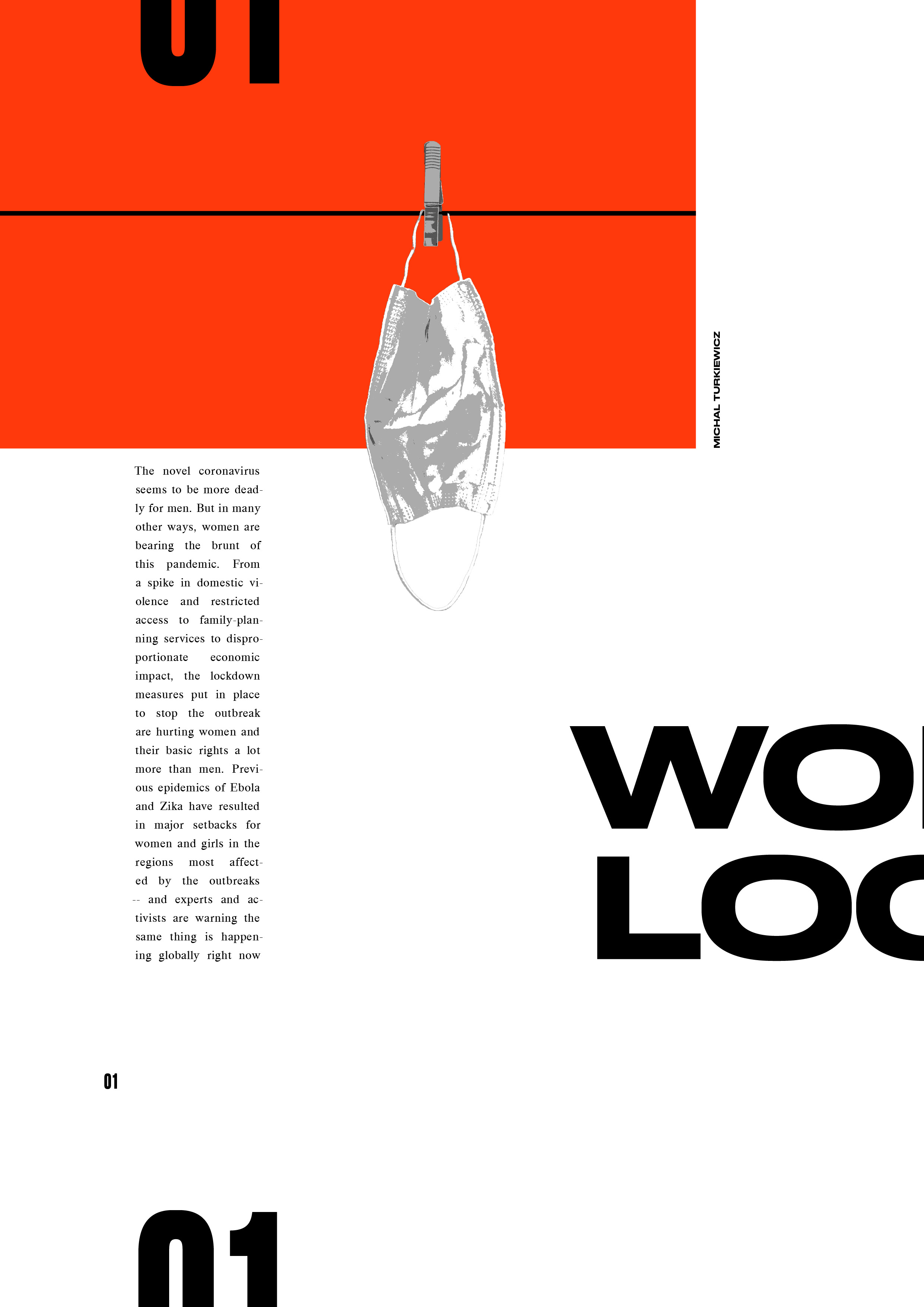
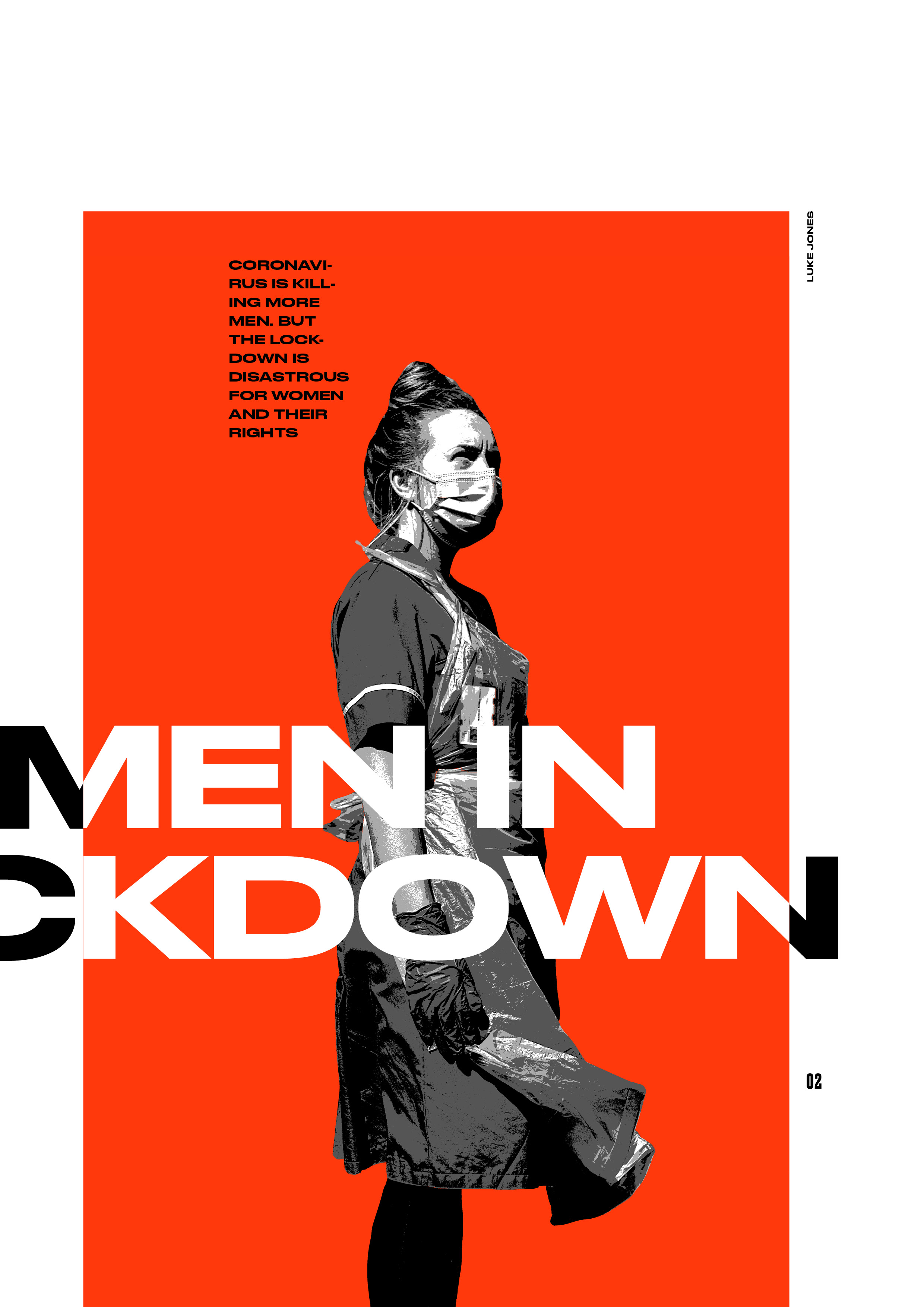
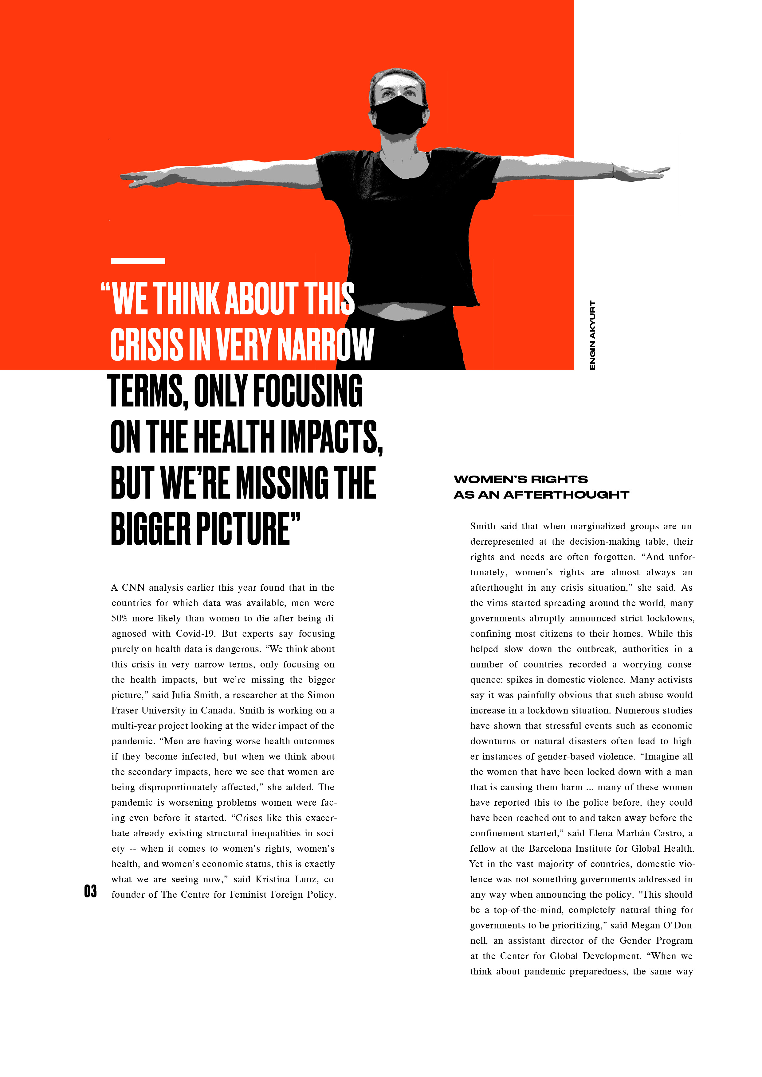
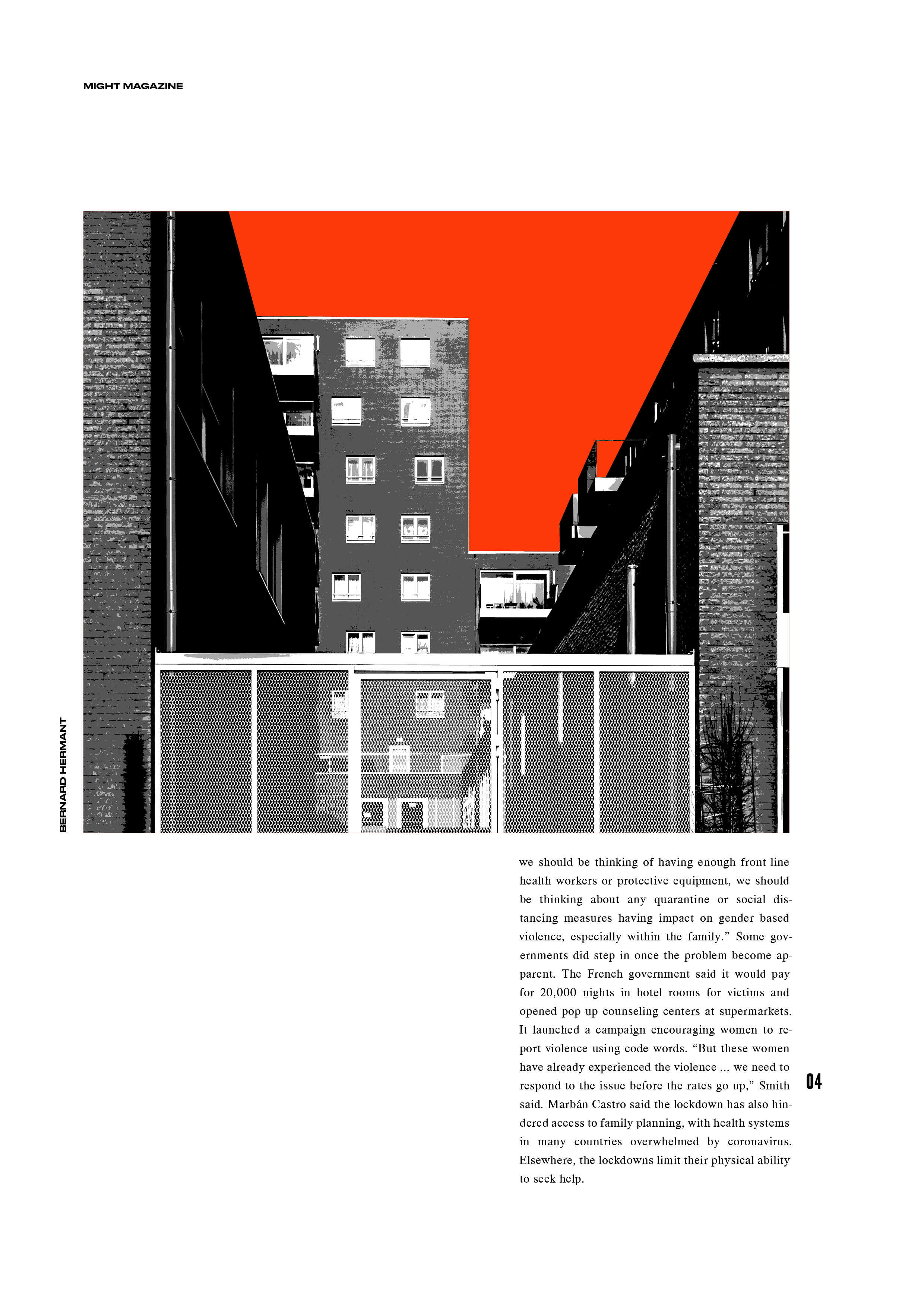
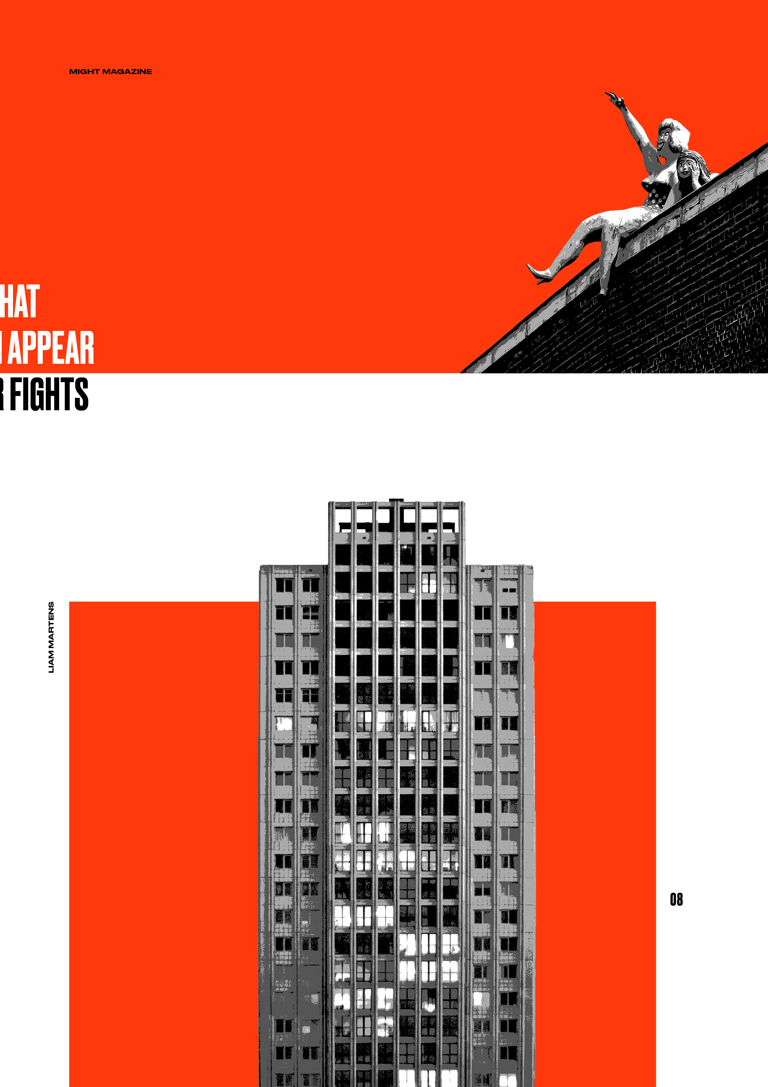
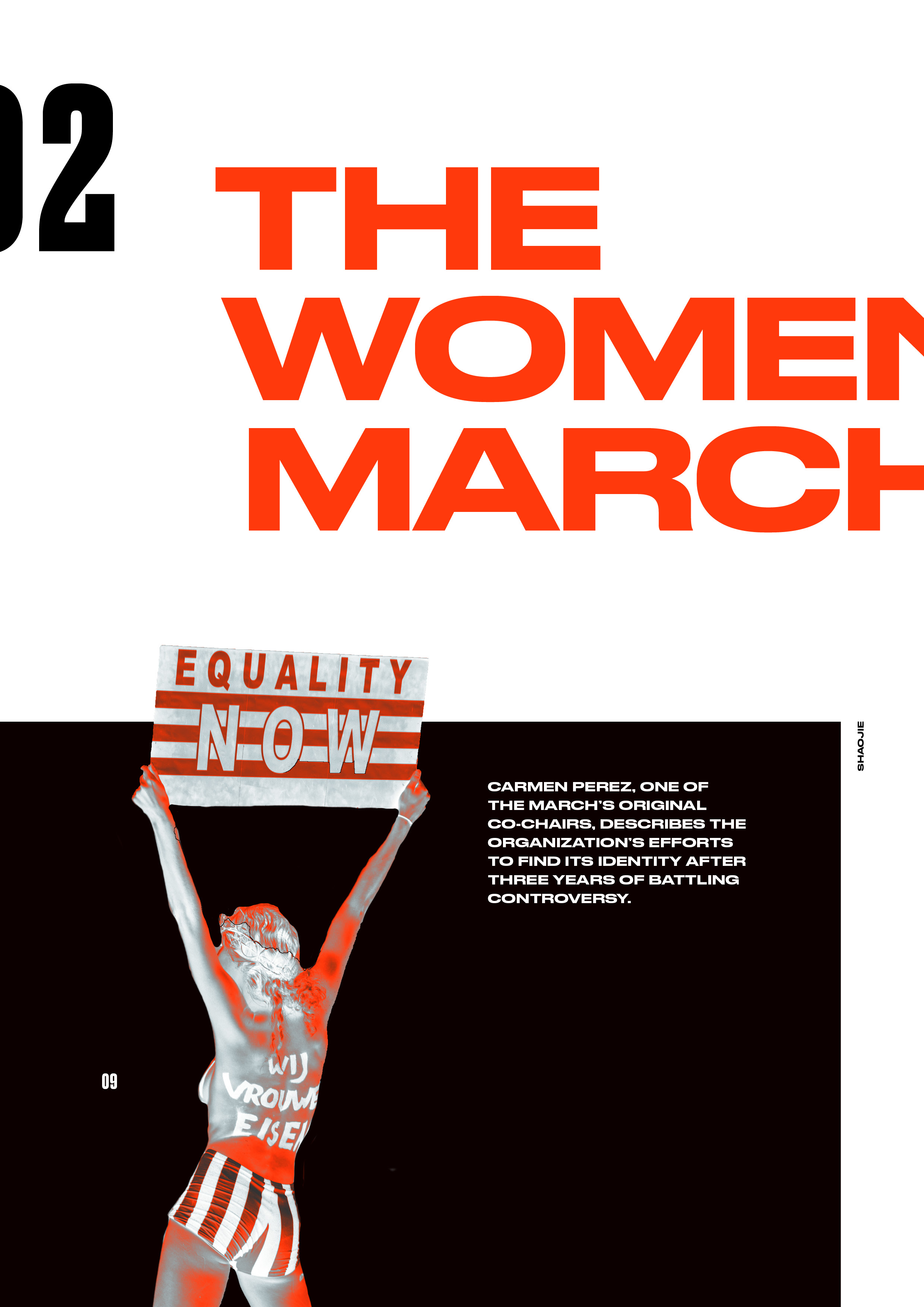
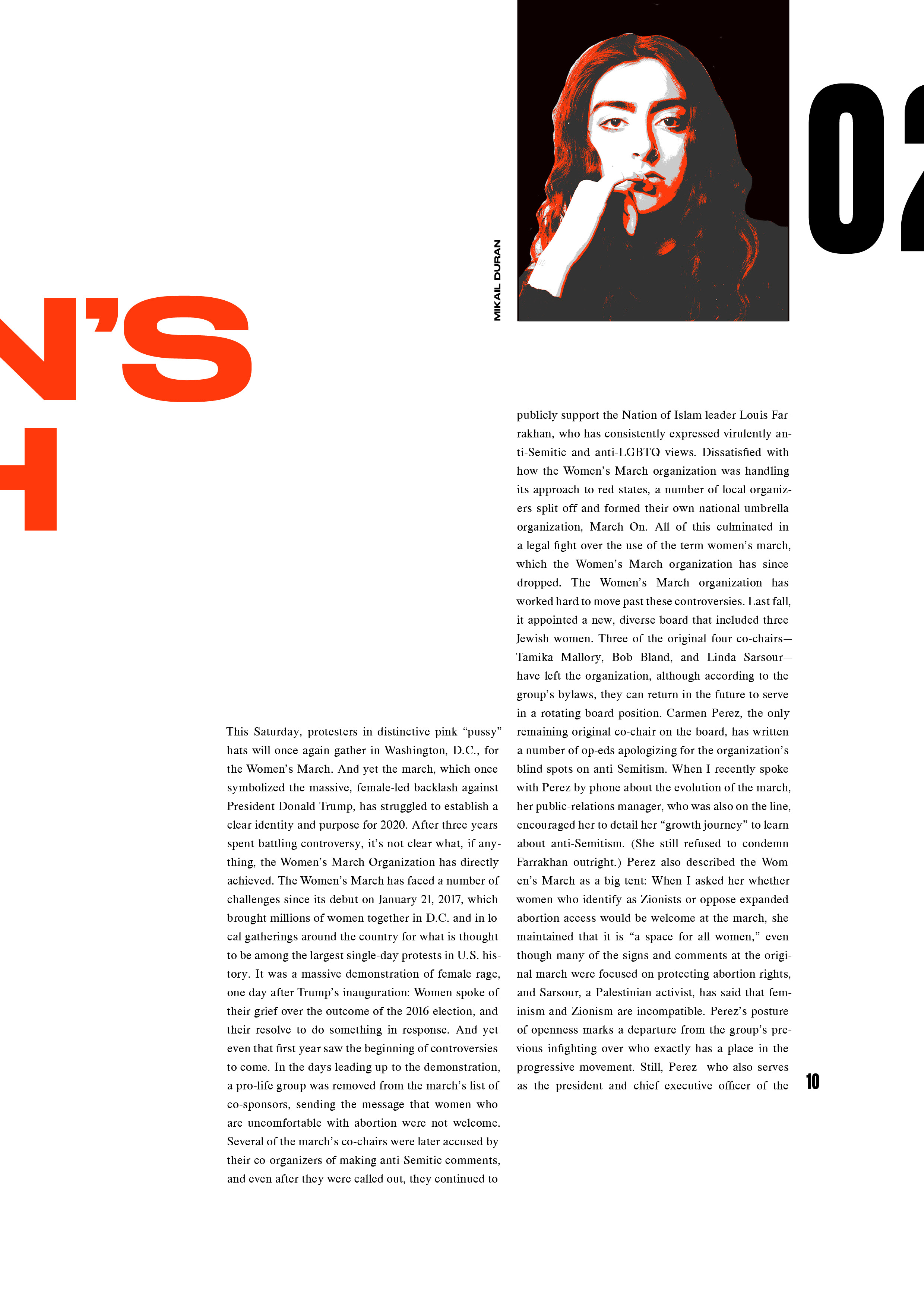
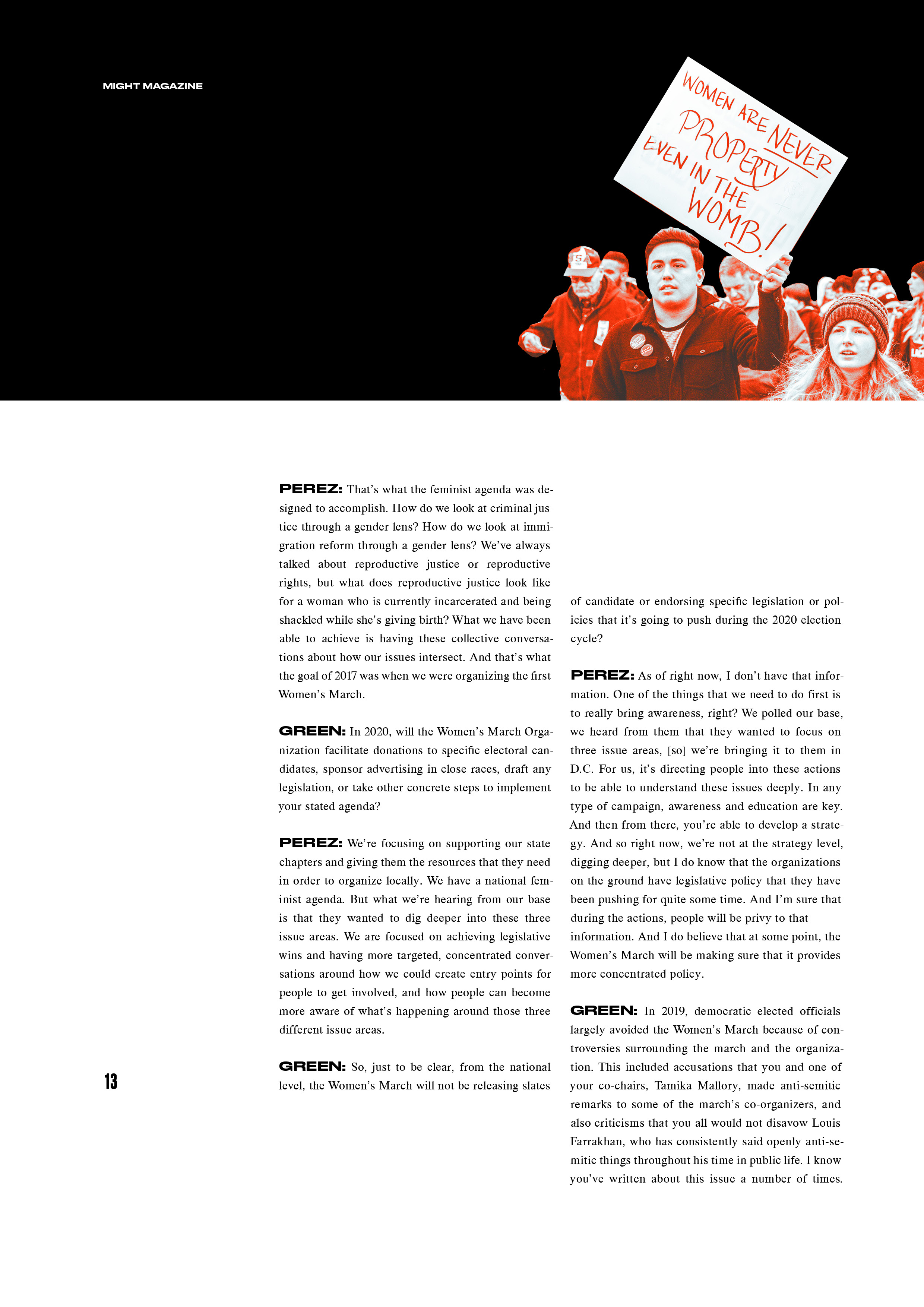
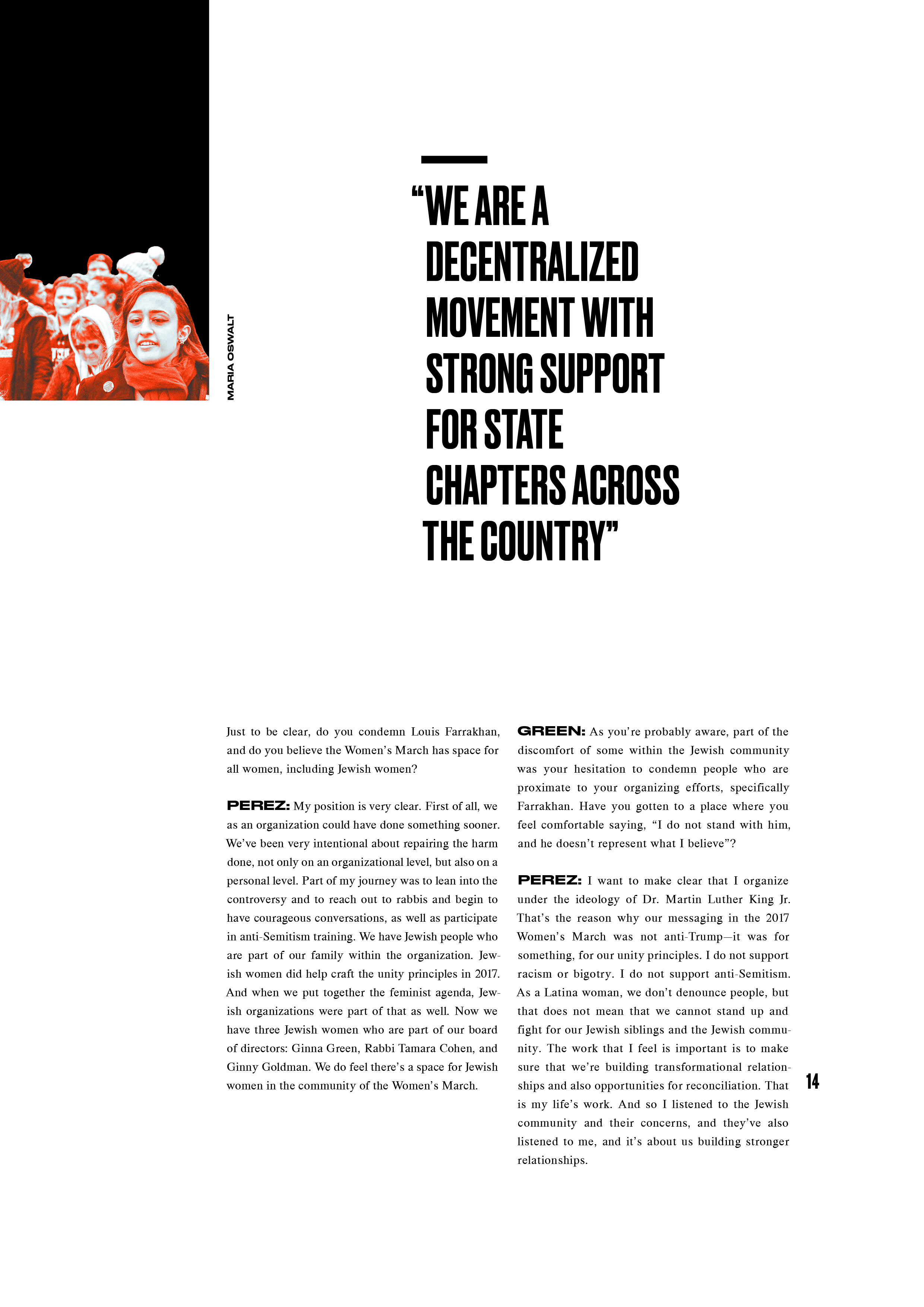
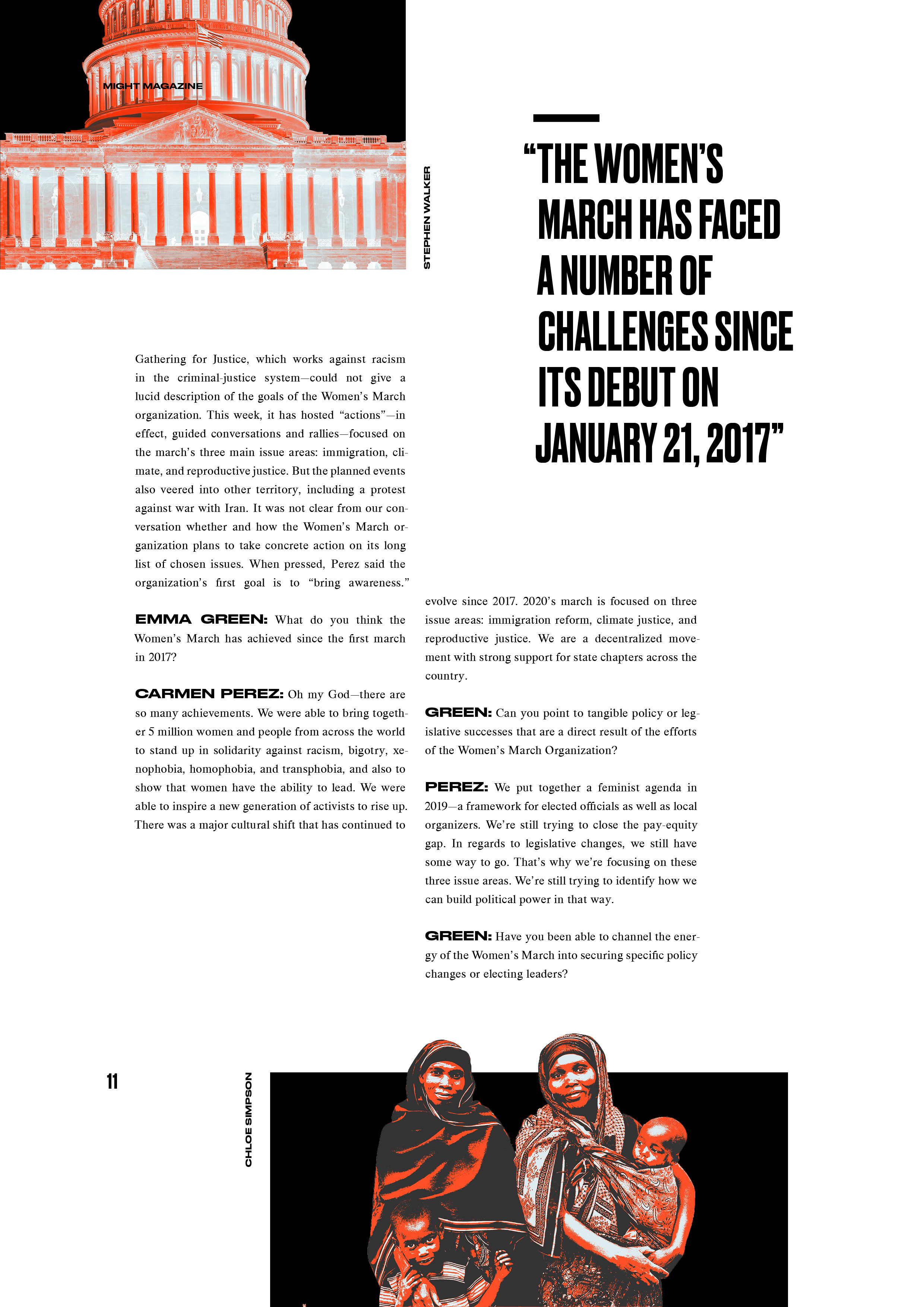
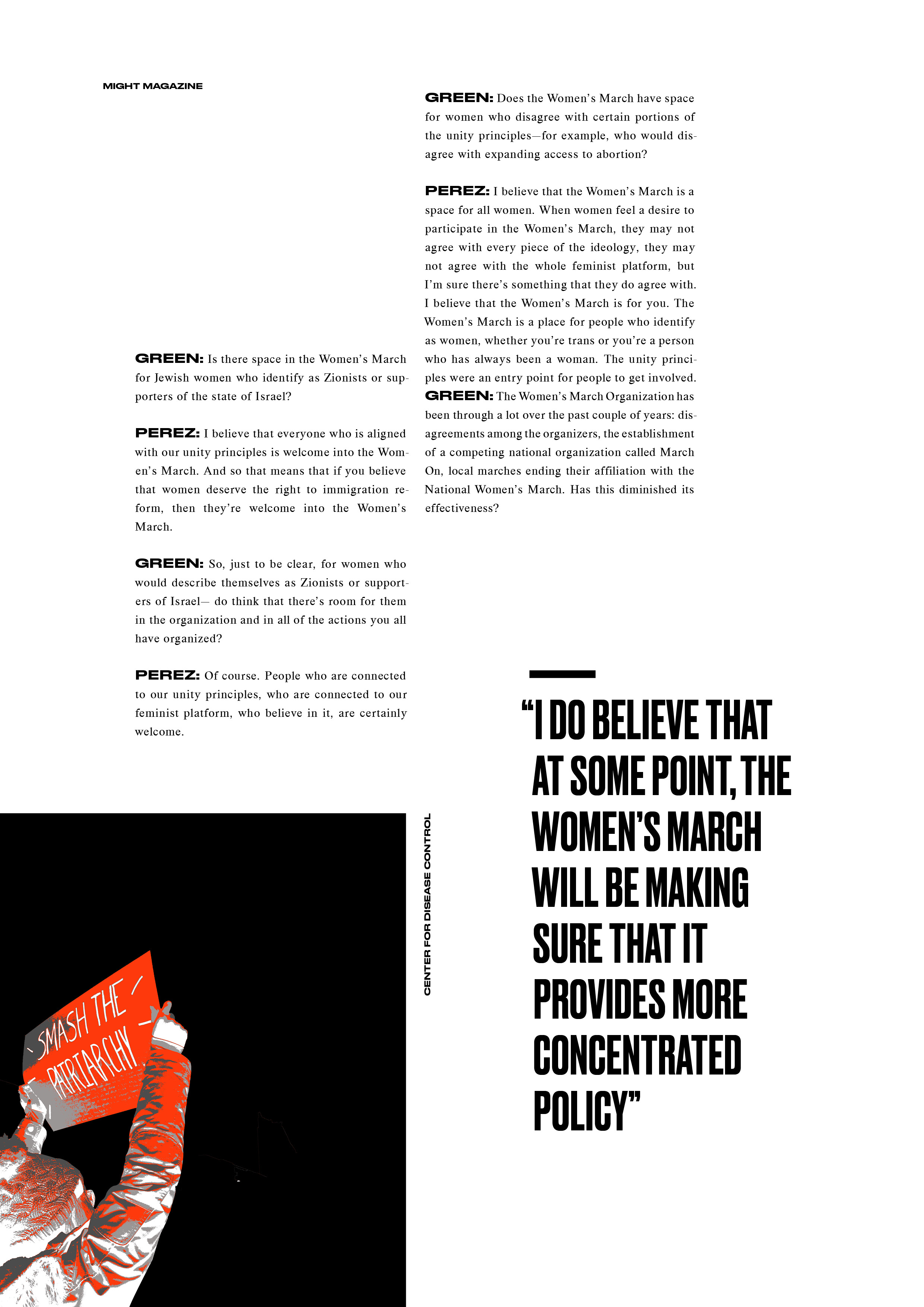
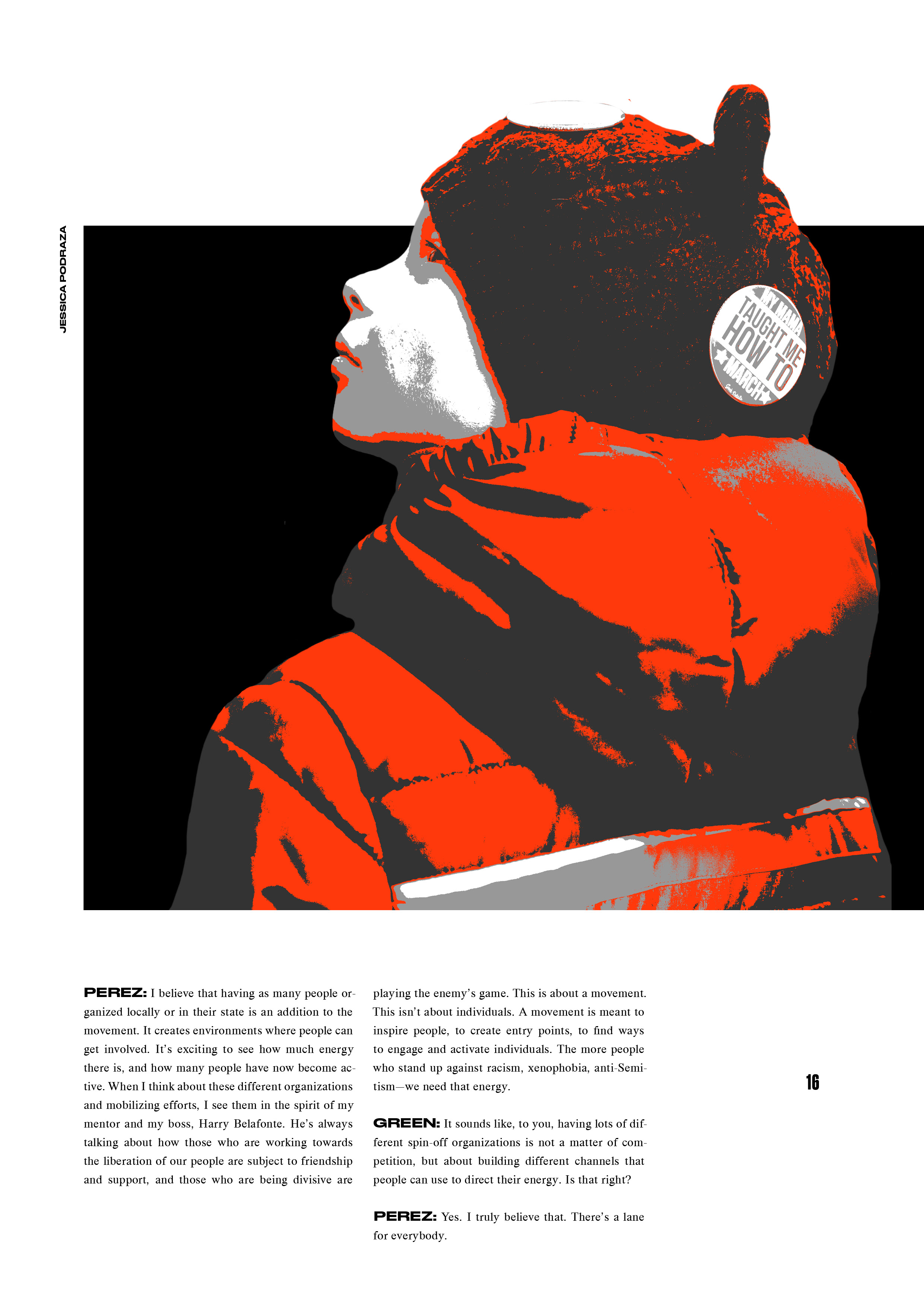
A strict grid with justified type conveys a sense of power, while images breaking out of their containers convey radicalism.
A strict grid with justified type conveys a sense of power, while images breaking out of their containers convey radicalism.

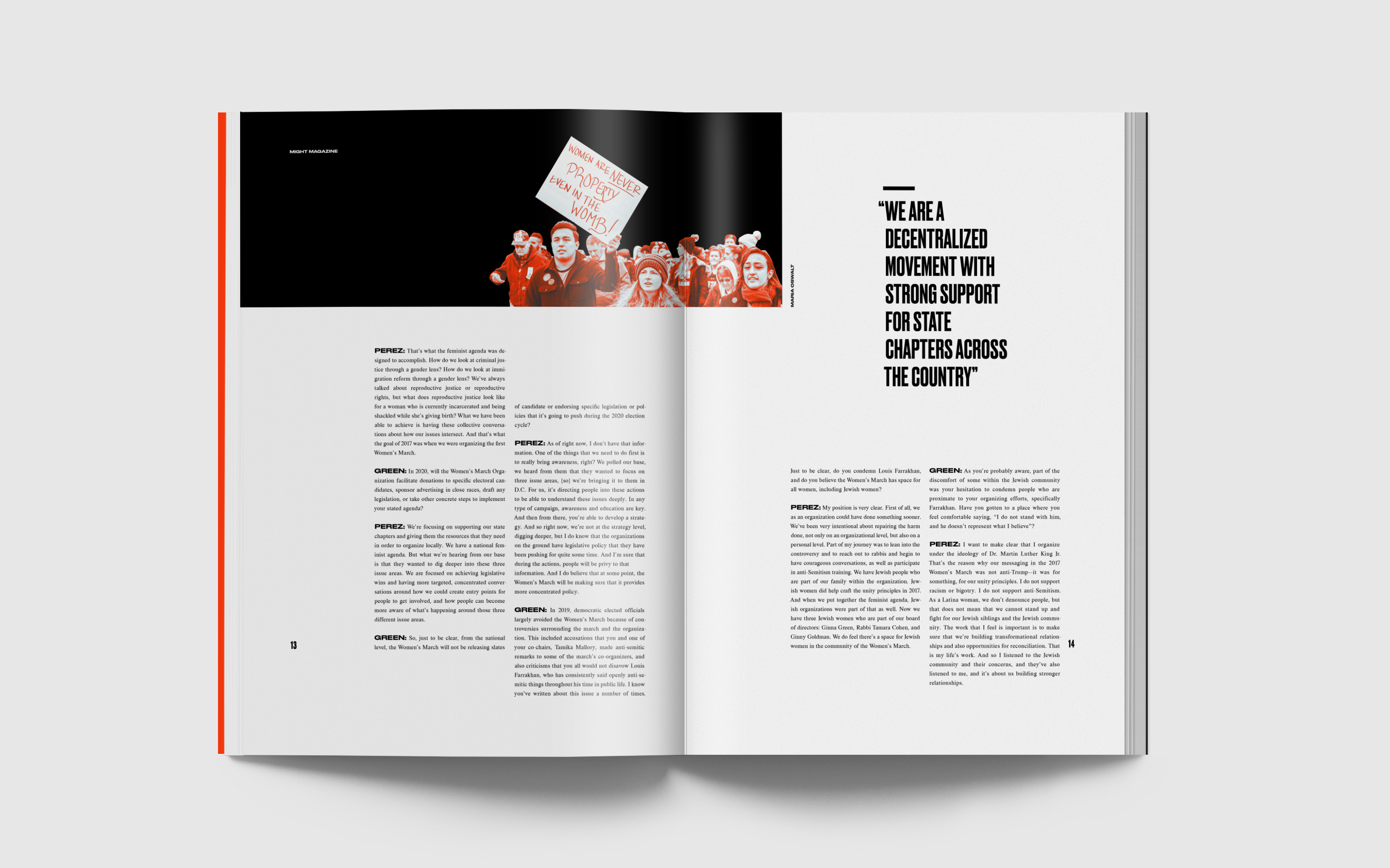
Final Feature Article Spreads
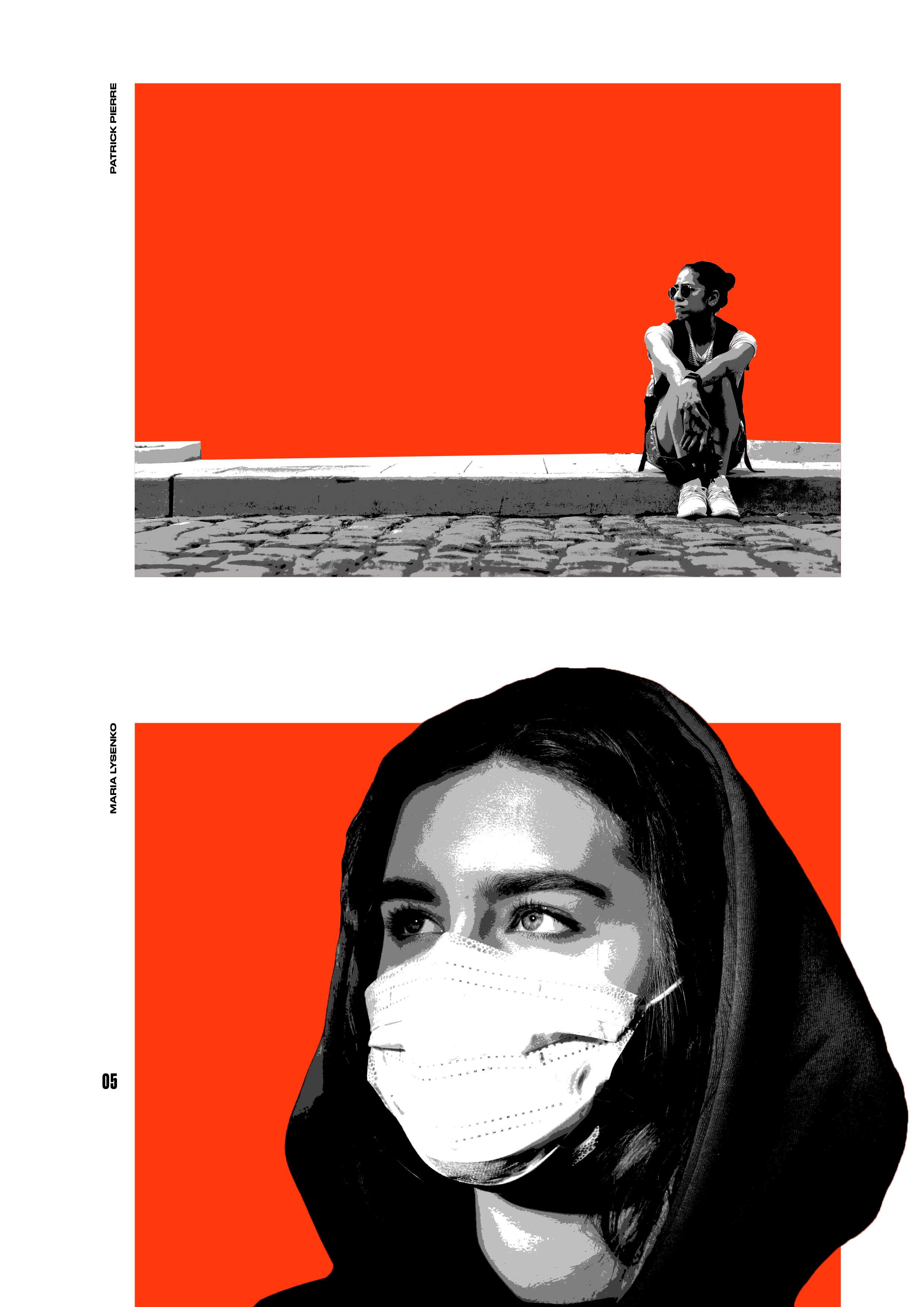


Final Interview Article Spreads

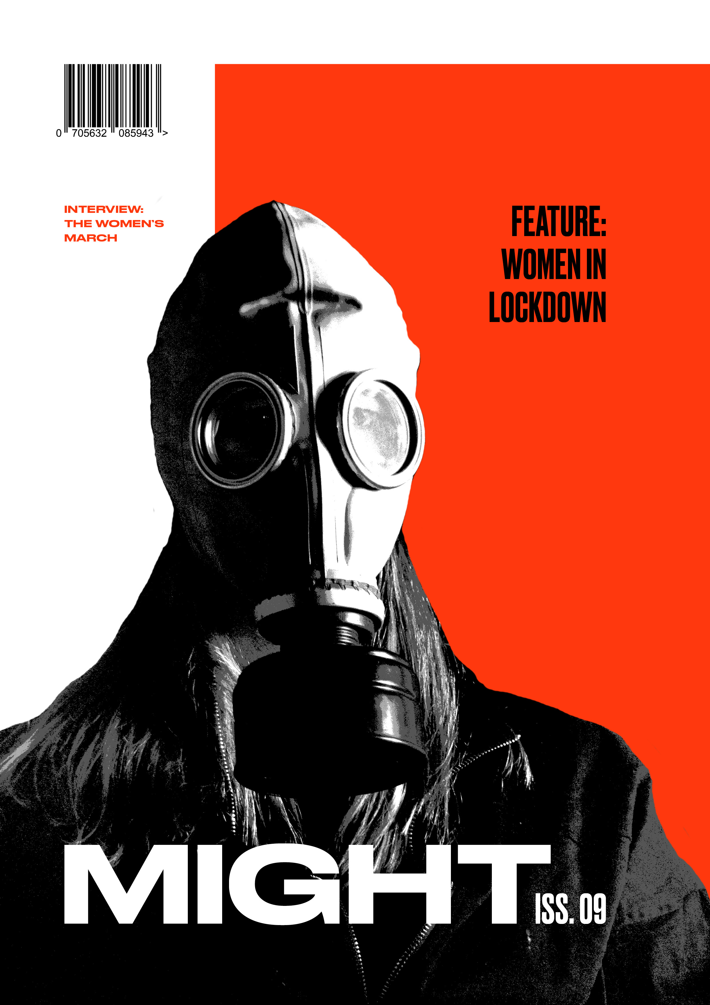
Final Cover Design
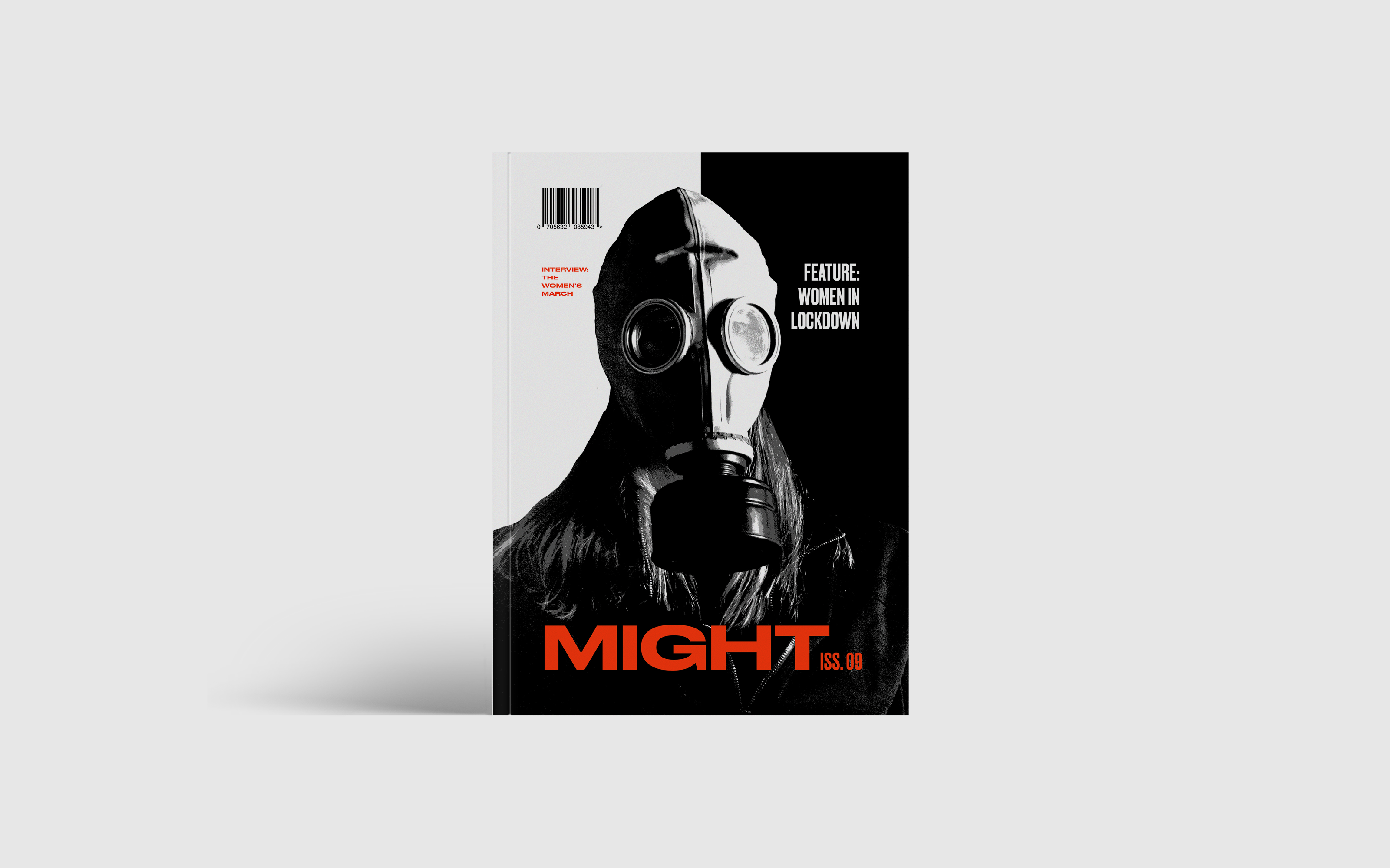
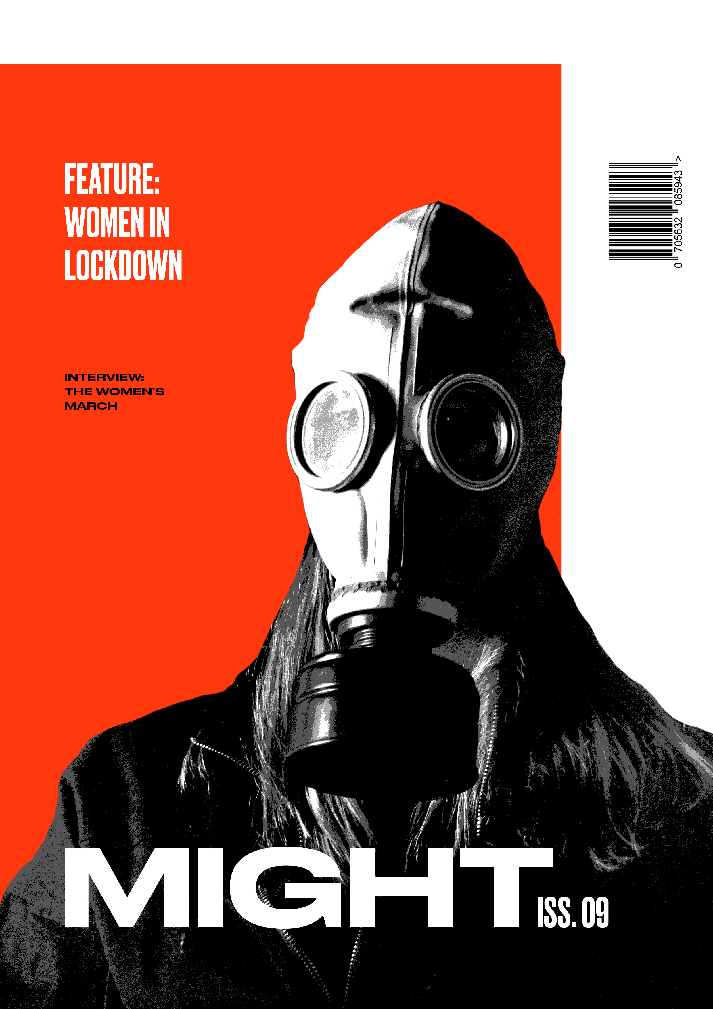
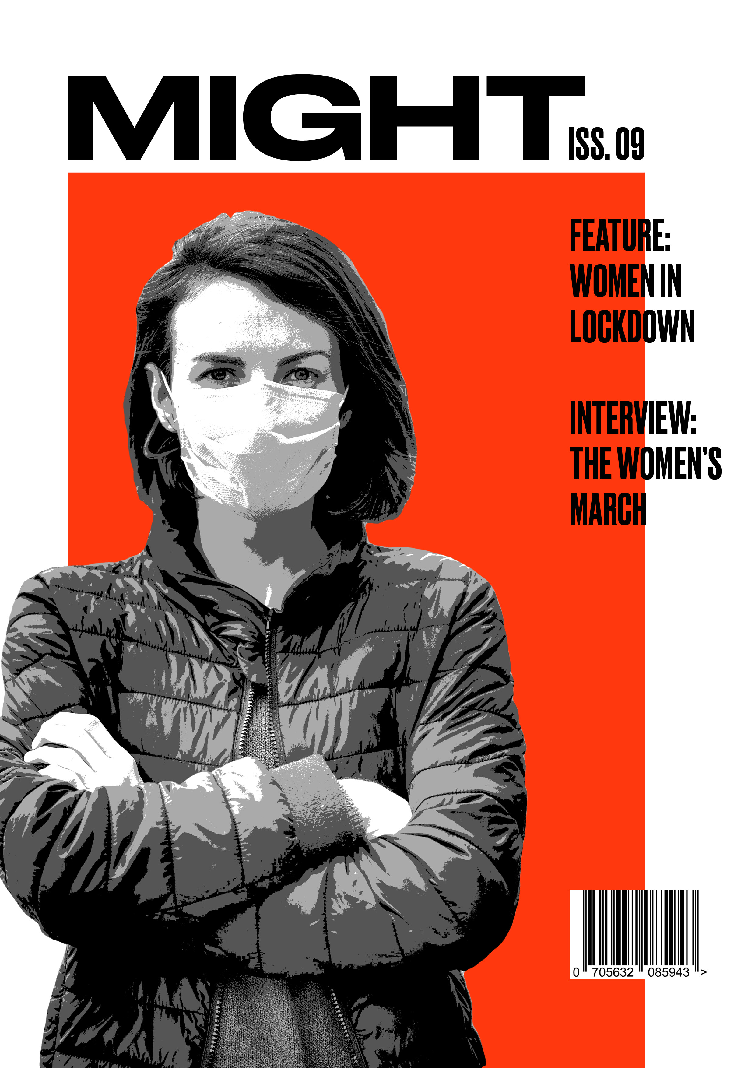
Using a center vertical line to break the grid, the cover design incorporates elements from both of the included articles. Radical imagery alludes to the content inside.
Using a center vertical line to break the grid, the cover design incorporates elements from both of the included articles. Radical imagery alludes to the content inside.
